The Key to a Great Public Space? It's In the Edges.
When you visit a place for the first time, odds are you have an immediate reaction to it that's more emotional than intellectual. It's beautiful or soothing or awe-inspiring or, conversely, perhaps boring or intimidating or disorienting. Much of this is influenced by our cultural norms and expectations. But there are also some truths rooted in basic, innate human psychology—and these truths have found their way into the living traditions of urban design as a sort of “spooky wisdom” that far predates modern architecture or urban planning.
One of these truths is that humans exhibit the biological principle of thigmotaxis: a preference for hugging the edges of a space instead of lingering out in the exposed center. The reasons for this preference are fairly obvious: under shelter and with your back to a barrier like a wall or a tree, you are better protected from threats ranging from weather to predators, and better able to scan your environment and acquire a base level of comfort.
The most effective public spaces accommodate this “wall-hugging” preference—and some truly disastrous ones ignore it.
The famous public squares of Savannah, Georgia, are hardly a place where you're apt to need to escape a hungry lion. Nonetheless, their designers understood thigmotaxis well—even if they didn't have the word to put to it—and the proof is in the pudding.
This Place is All Edges
Here is a slideshow of photos from Chippewa, Wright, and Johnson Squares in Savannah. What's the first thing you notice about these popular strolling and gathering spaces? They’re basically all edges. Planted beds subdivide a small park into discrete walkways and areas to linger. A long bench encloses a miniature plaza-within-a-plaza on three sides. Fountains and brick-lined planting squares also delineate space and create visually pleasing boundaries. You’re never more than a few steps from a visual edge of some sort. Anywhere you go here, you're walking along a line that guides you forward. The result is a deeply comforting space, and an inviting one.
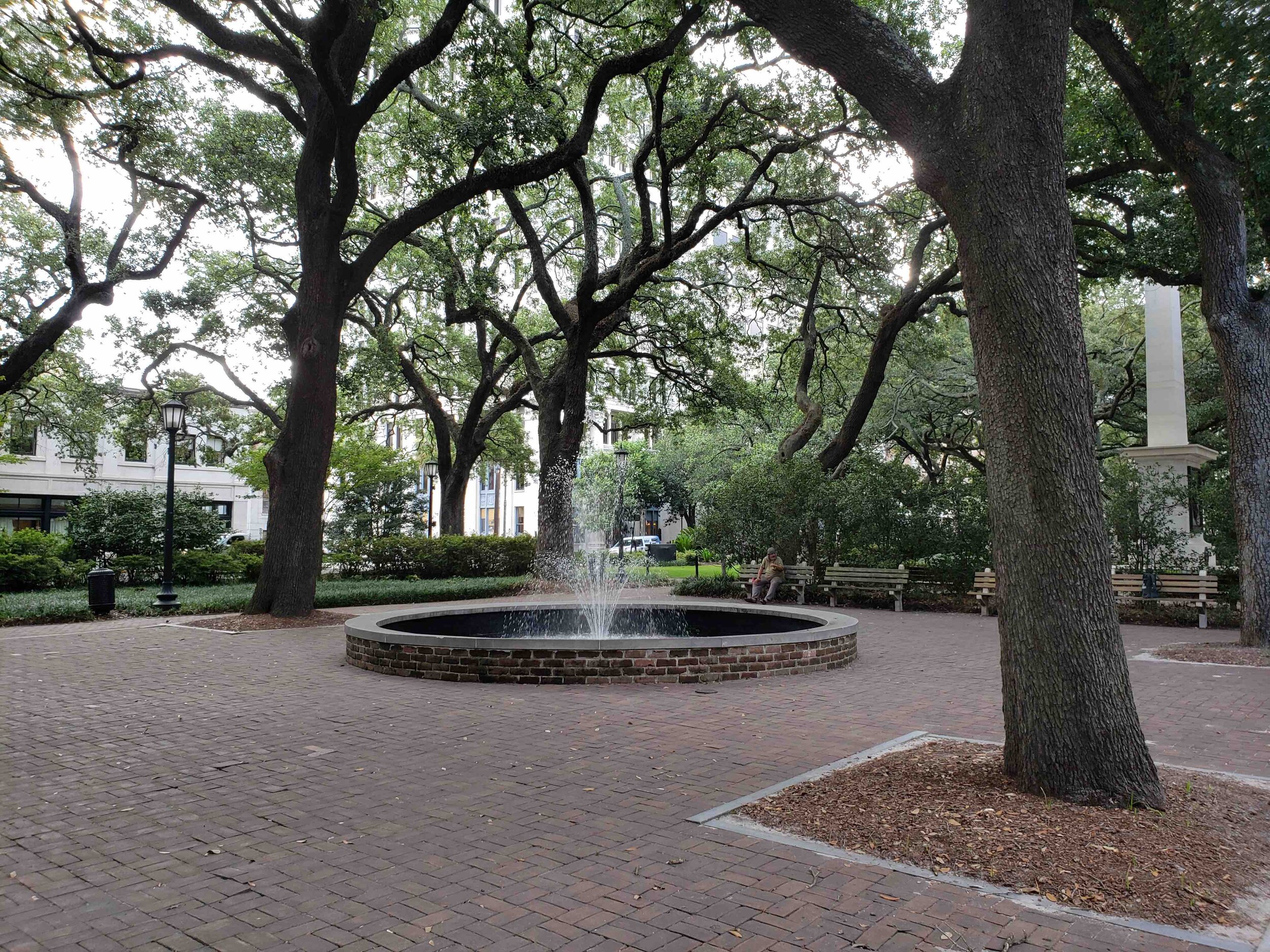
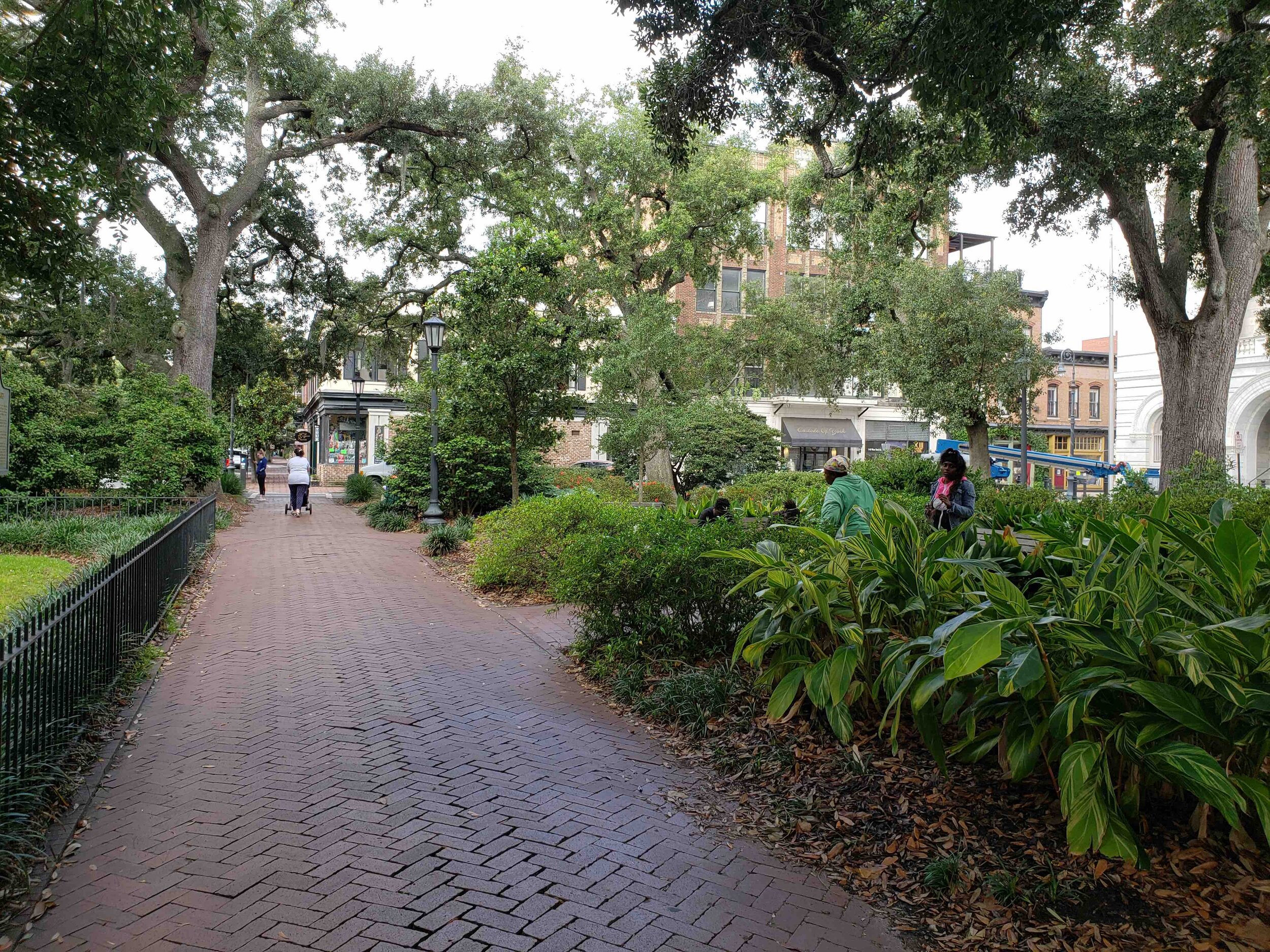
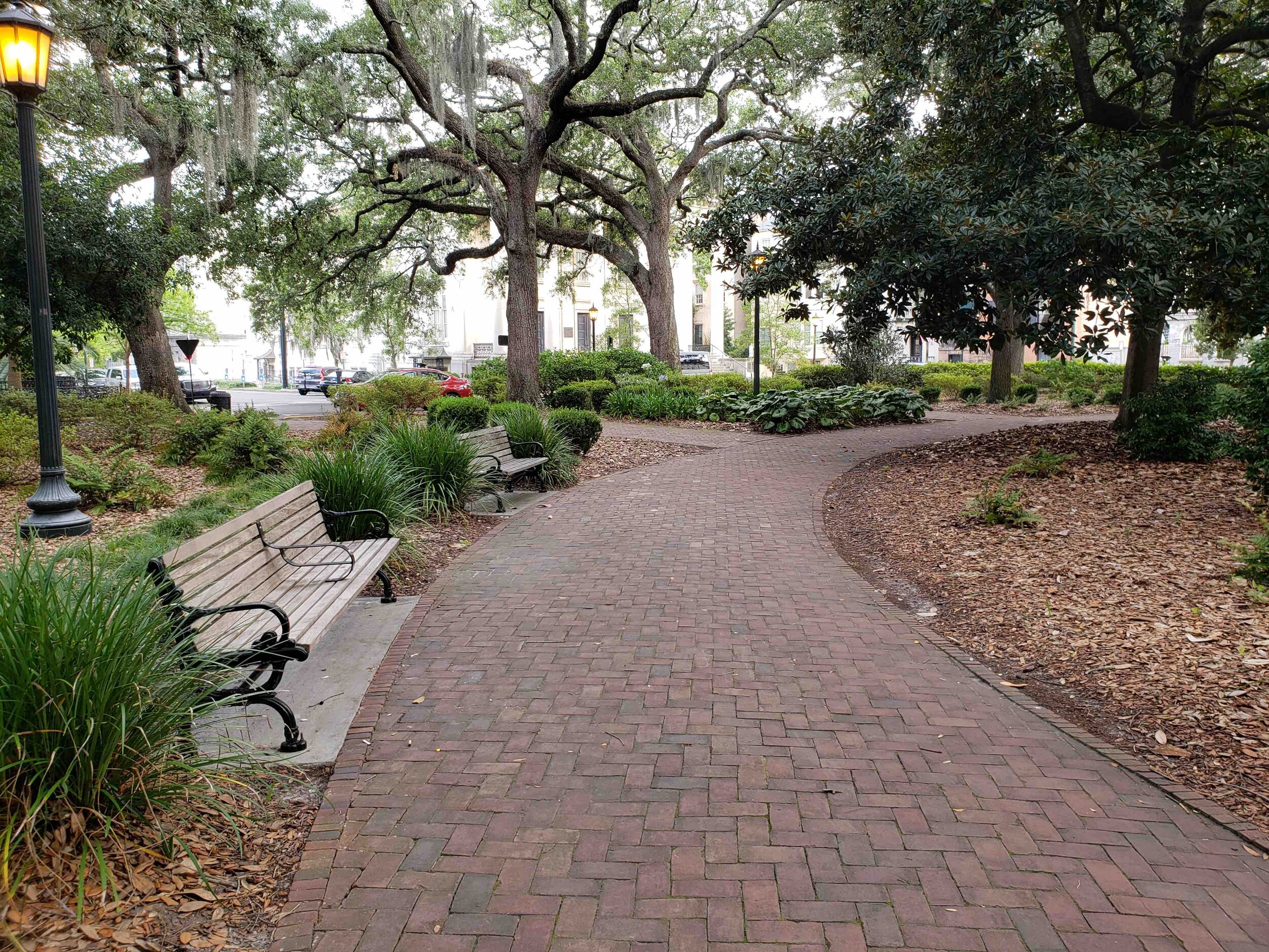
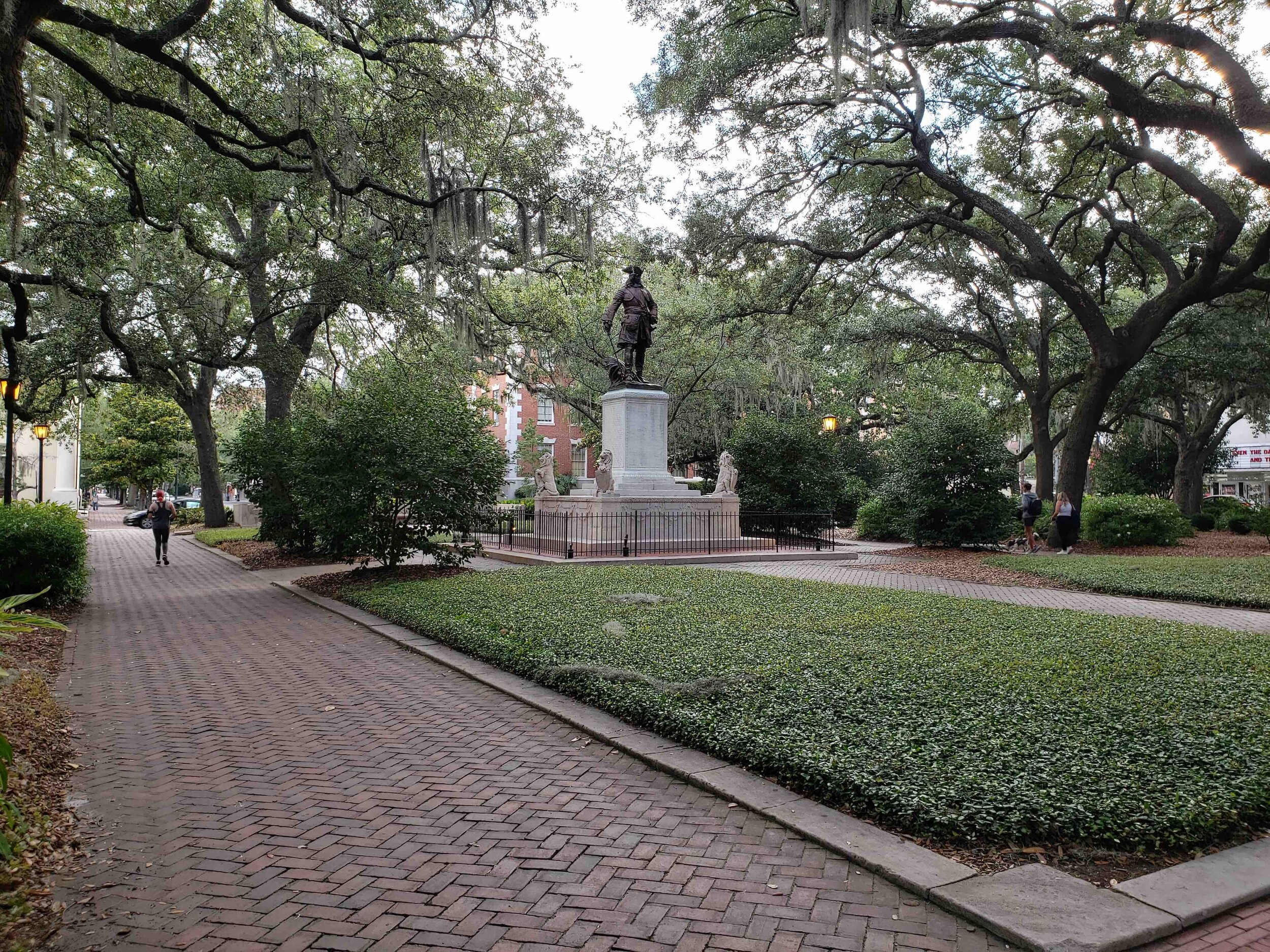
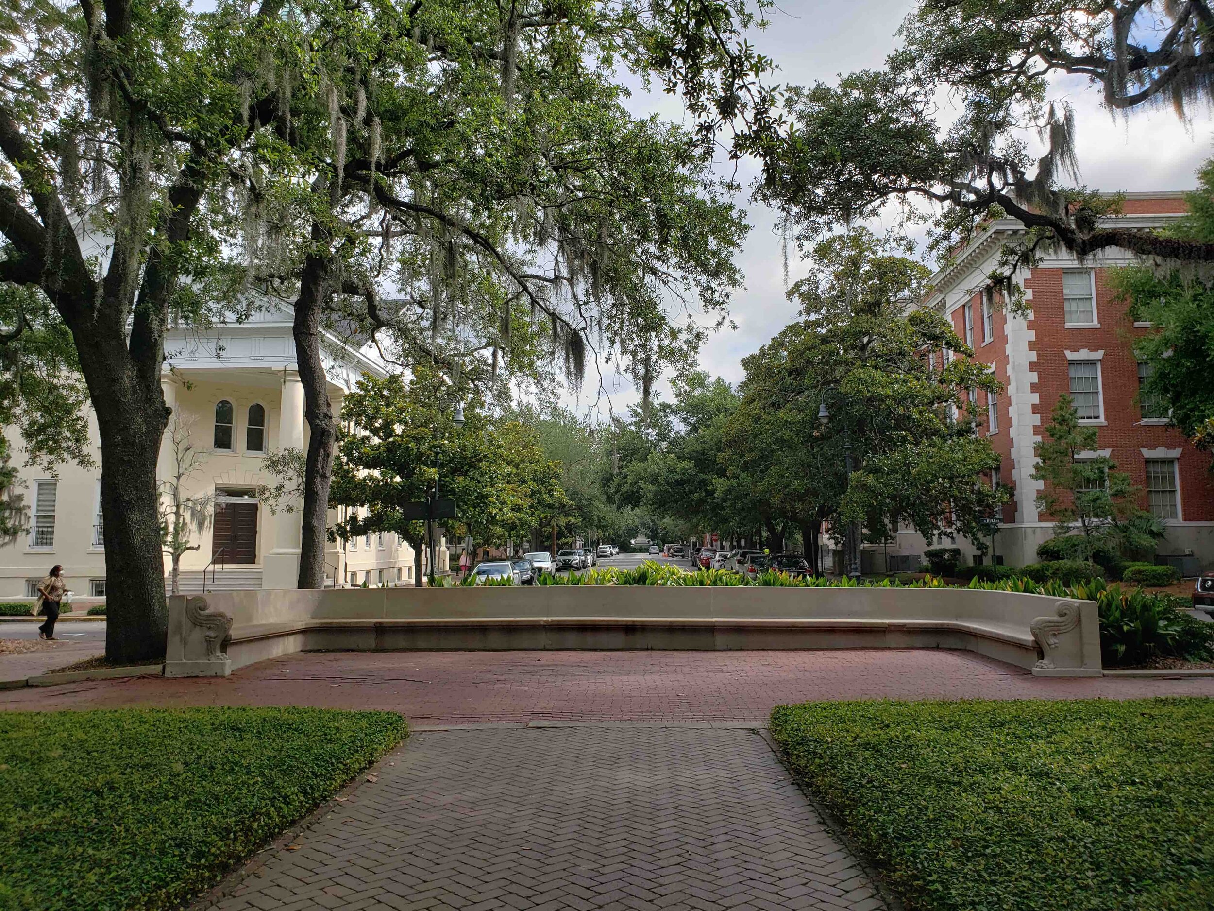
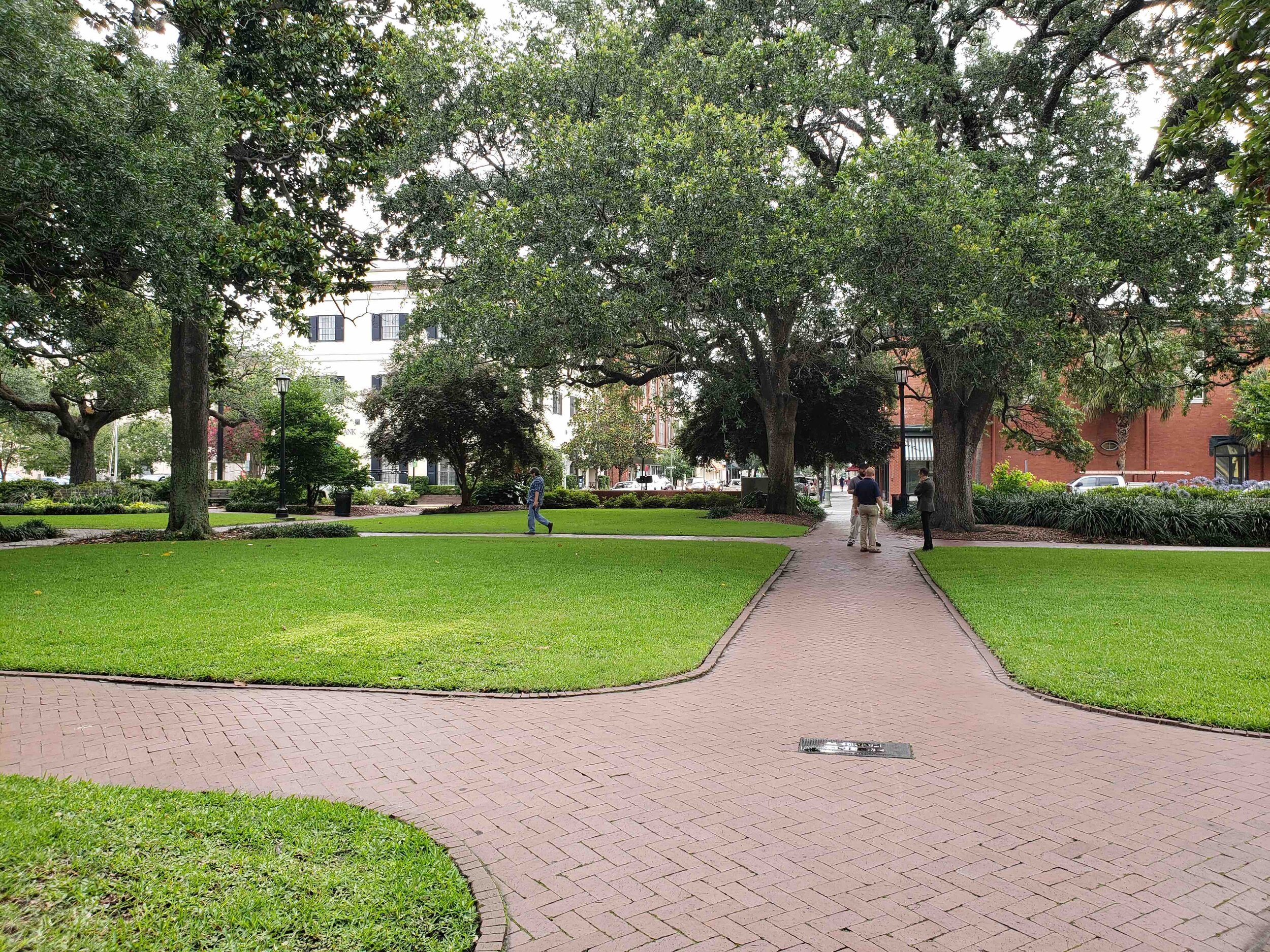
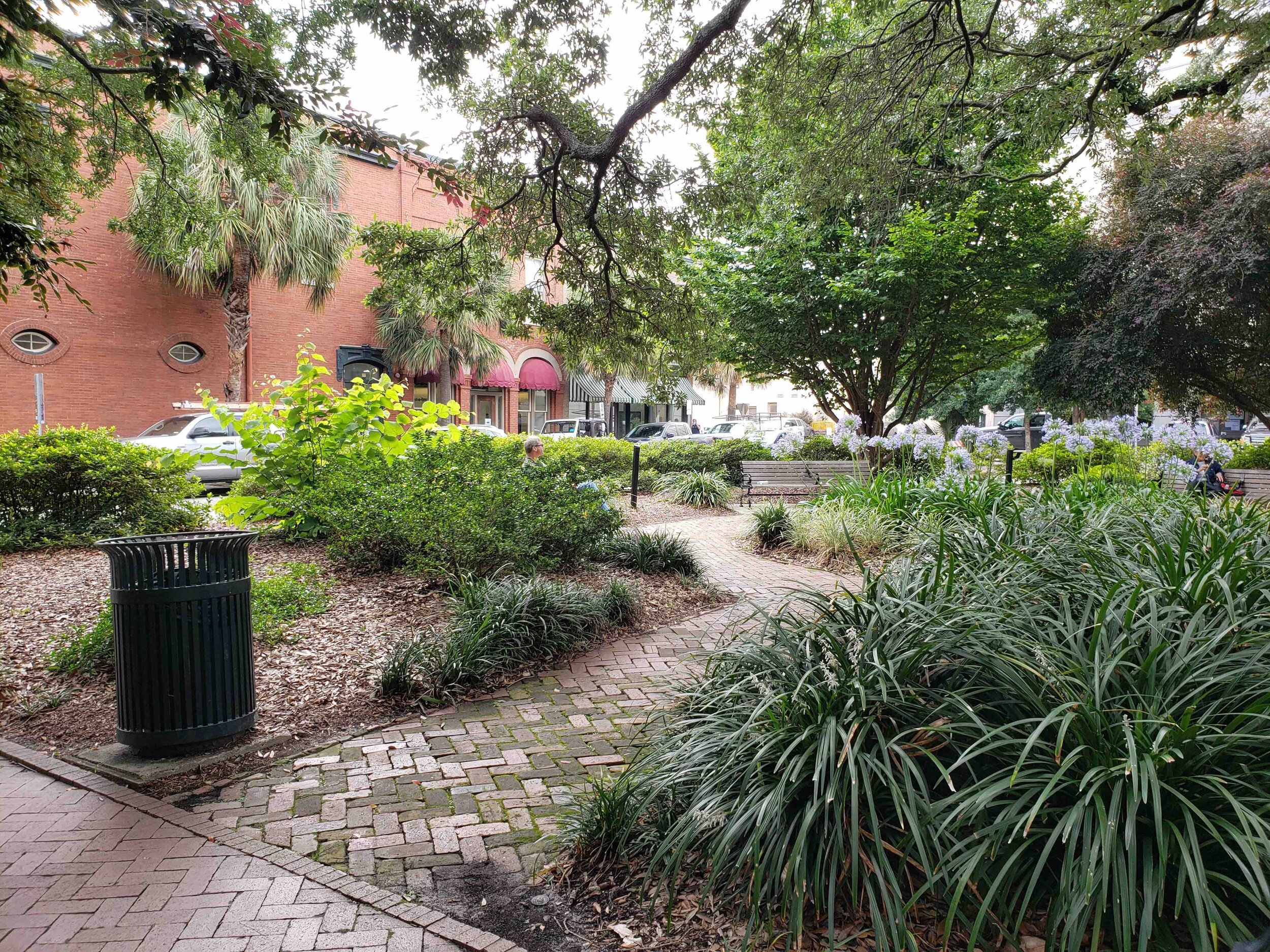
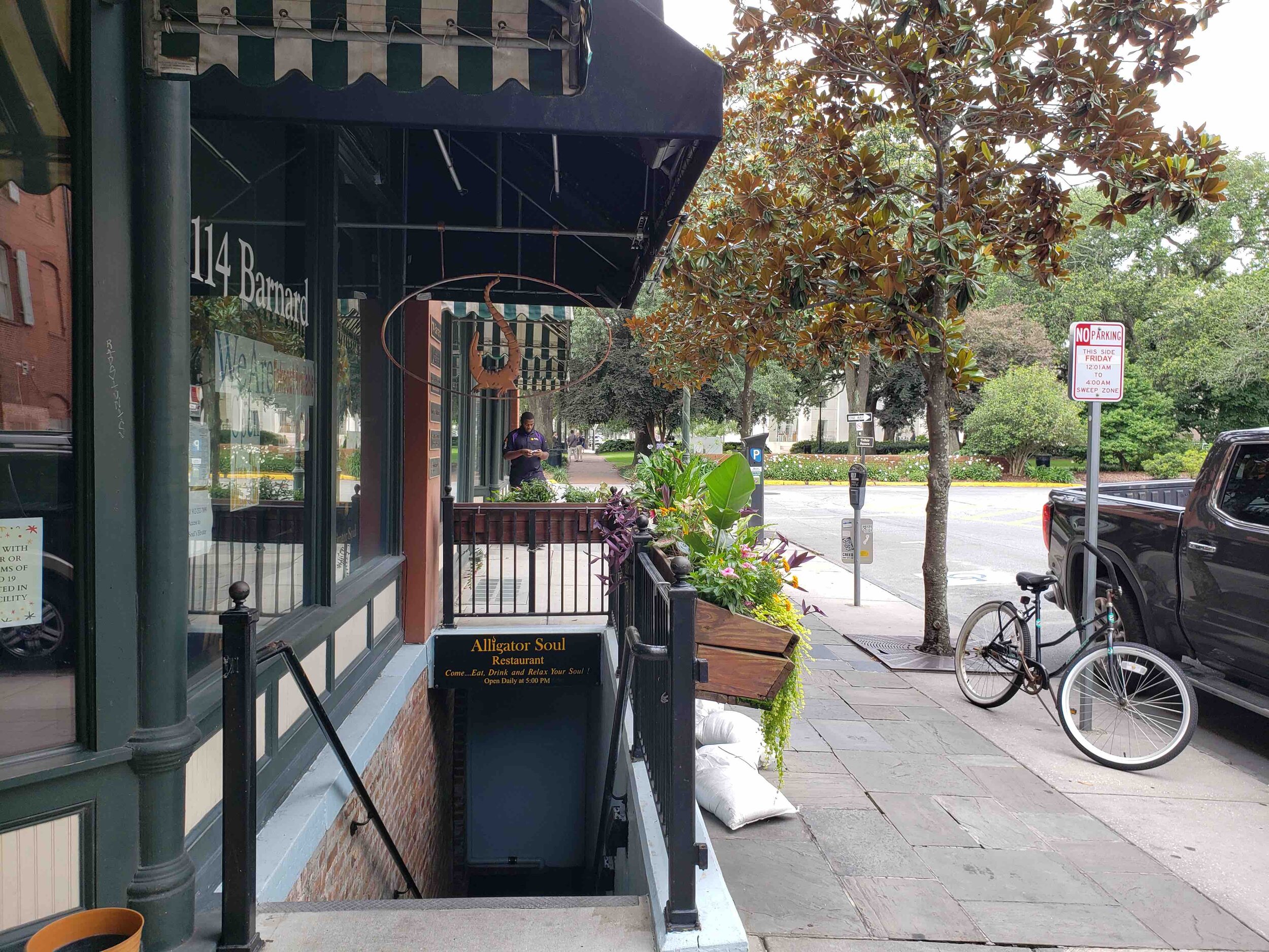
Here's something else important. The edges within the square align with the building facades and curbs along the adjacent blocks, as with the corner coffee shop and basement restaurant pictured here:
The sidewalks of historic Savannah never detour around the edges of the squares but pass right through them, providing an unbroken feeling of a continuous corridor as you travel on foot or two wheels. This doesn't just lure shop and café patrons into the squares; it equally serves an invitation for square strollers into the city.
This simple fact is deceptively powerful. It means that the squares are a stage on which the city—the restaurants, the bars, the churches, the museums, the shops, the private homes—performs. They are a frame around the city which ennobles its mundane details, in much the same way that a frame around a photograph lends immediate gravitas and permanence to what would otherwise be a flimsy 5 by 7 inch piece of card stock.
The emphasis on edges here—again, rooted in the psychology of thigmotaxis—is crucial. An edge is a boundary between two things, which means every edge is also a gateway to something, a point of transition. The squares and the sidewalks of Savannah are gateways to the city.
This is at odds with the more modern, and probably too common, understanding of a park as an escape from the city. Of course, a park (especially a large one) can serve this function, but in an urban setting like Savannah, that is the last thing you would want. A large open space like woods or a grassy field might serve its own useful purposes, but it would break up the urban fabric and it would present a barrier to exploration on foot. Savannah's squares are not barriers to or interruptions of the city: they are invitations to the city.
This is a pro-social way to design. And it's a financially smart one, too, if you're playing the long game—as Savannah's 18th-century founders such as James Oglethorpe clearly were. It results in a place of resilient value. Even as buildings, residents, and businesses come and go, the squares endure, and they announce, "This is a worthy, important place.” Not a single square foot of it is nowhere. All of it is somewhere.
In my opinion, the least effective of historic Savannah’s squares just may be the exception that proves the rule. Ellis Square lacks the elegant shade of century-old live oaks for a simple reason: it was created in only 2009. The original incarnation was plowed under in the 1950s for—what else—a parking garage. (Can I get a collective facepalm here?) But the problem with its reborn form is that it’s too much middle, not enough edge. In photos, you can see clearly where Ellis Square’s patrons choose to hang out: the edges. The center is a bit of a dead zone, and it interrupts the thigmotactic tendency to walk right through it on your way to explore the next block of shops and cafés. (Doubly so because the grade separation, with stairs, is hostile to anyone in a wheelchair or on a bicycle.)
The takeaway here: focus on the edges if you want to build public spaces that feel like somewhere.




Daniel Herriges has been a regular contributor to Strong Towns since 2015 and is a founding member of the Strong Towns movement. He is the co-author of Escaping the Housing Trap: The Strong Towns Response to the Housing Crisis, with Charles Marohn. Daniel now works as the Policy Director at the Parking Reform Network, an organization which seeks to accelerate the reform of harmful parking policies by educating the public about these policies and serving as a connecting hub for advocates and policy makers. Daniel’s work reflects a lifelong fascination with cities and how they work. When he’s not perusing maps (for work or pleasure), he can be found exploring out-of-the-way neighborhoods on foot or bicycle. Daniel has lived in Northern California and Southwest Florida, and he now resides back in his hometown of St. Paul, Minnesota, along with his wife and two children. Daniel has a Masters in Urban and Regional Planning from the University of Minnesota.