We Can Have Both More Housing and Good Urban Form
The density question is one that I get so frequently that I wrote an article about it way back in 2015. What is the proper density required to build a Strong Town? In these conversations, I typically point out that, if you ask a zoner to deliver you density, they will gleefully deliver you density, but you’re not going to like it.
I’m on my city’s planning commission. We recently adopted a new comprehensive plan (I was on the committee) that called for more density (in ways I wasn’t completely comfortable with). We then rewrote our entire zoning code (I was not involved) in a way that delivered more density.
Predictably, people don’t like it. I don’t like it, either.
“I don’t know what value that is going to add to my neighborhood,” was one of the public comments that made the local paper following a recent meeting. The comment fell on mostly deaf ears, largely because the answer was both obvious and uncomfortable for my colleagues. The proposed apartment building will add five two-room units to the neighborhood. Building more housing is a goal of our comprehensive plan. But, this proposal does so in a way that clearly disrespects and detracts from the neighborhood, which is in conflict with others goals of the comprehensive plan.
This conflict does not need to exist. We can have both more housing and good urban form. Poorly written zoning codes are where good intentions formed in a planning process go to die. Our community’s intentions, as reflected in our comprehensive plan, are on life support. It doesn’t need to be this way.
I’m not a fan of using the density metric in a zoning code, and I don’t think density is the metric any community should be obsessing over, but I’m going to play along because this is the metric we’re working with in my city. If we’re sincere about the need for more density—and there are good reasons for us to be sincere—then we should be at least as passionate and obsessive about how that density manifests in our neighborhoods.
Is there a way to build densely where the neighbors welcome it instead of oppose it? Of course there is, but it’s not the way we’ve chosen with our new zoning code.
One of my colleagues spoke for the majority of the commission, expressing frustration with what he suggests is a subjective conversation over “what looks good, what doesn't look good, what looks best and so forth.” Yet, this conversation isn’t subjective, at all.
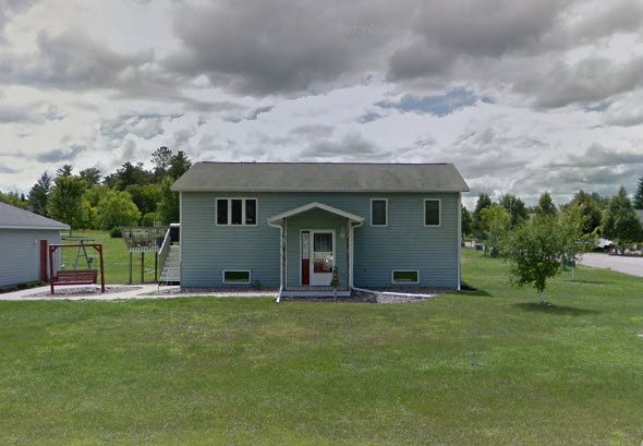
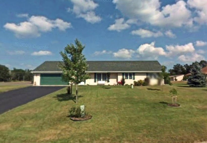
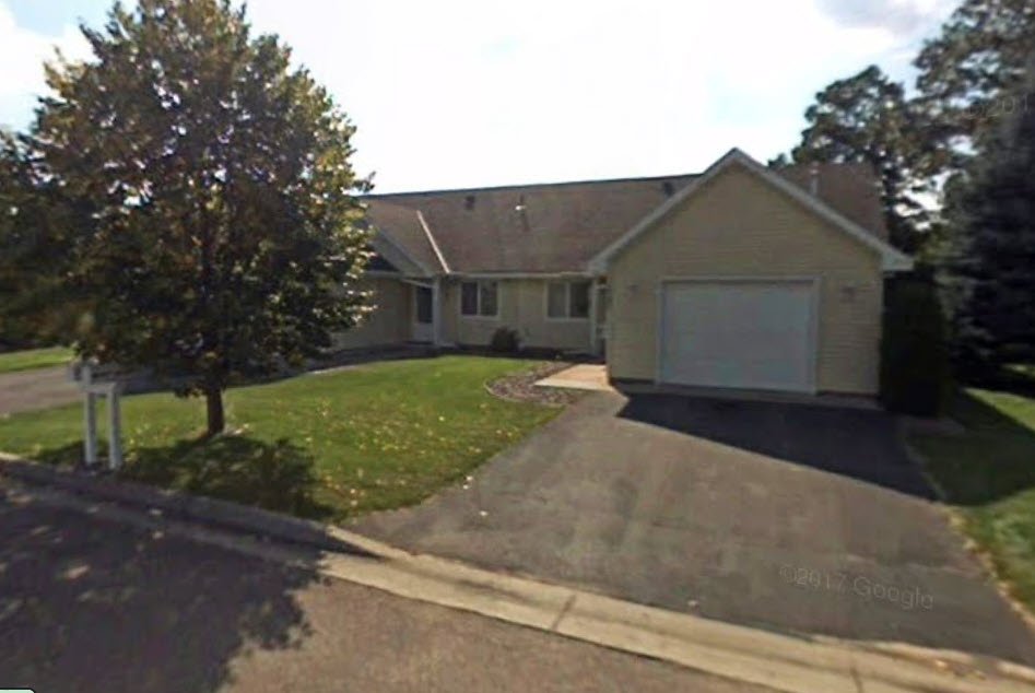
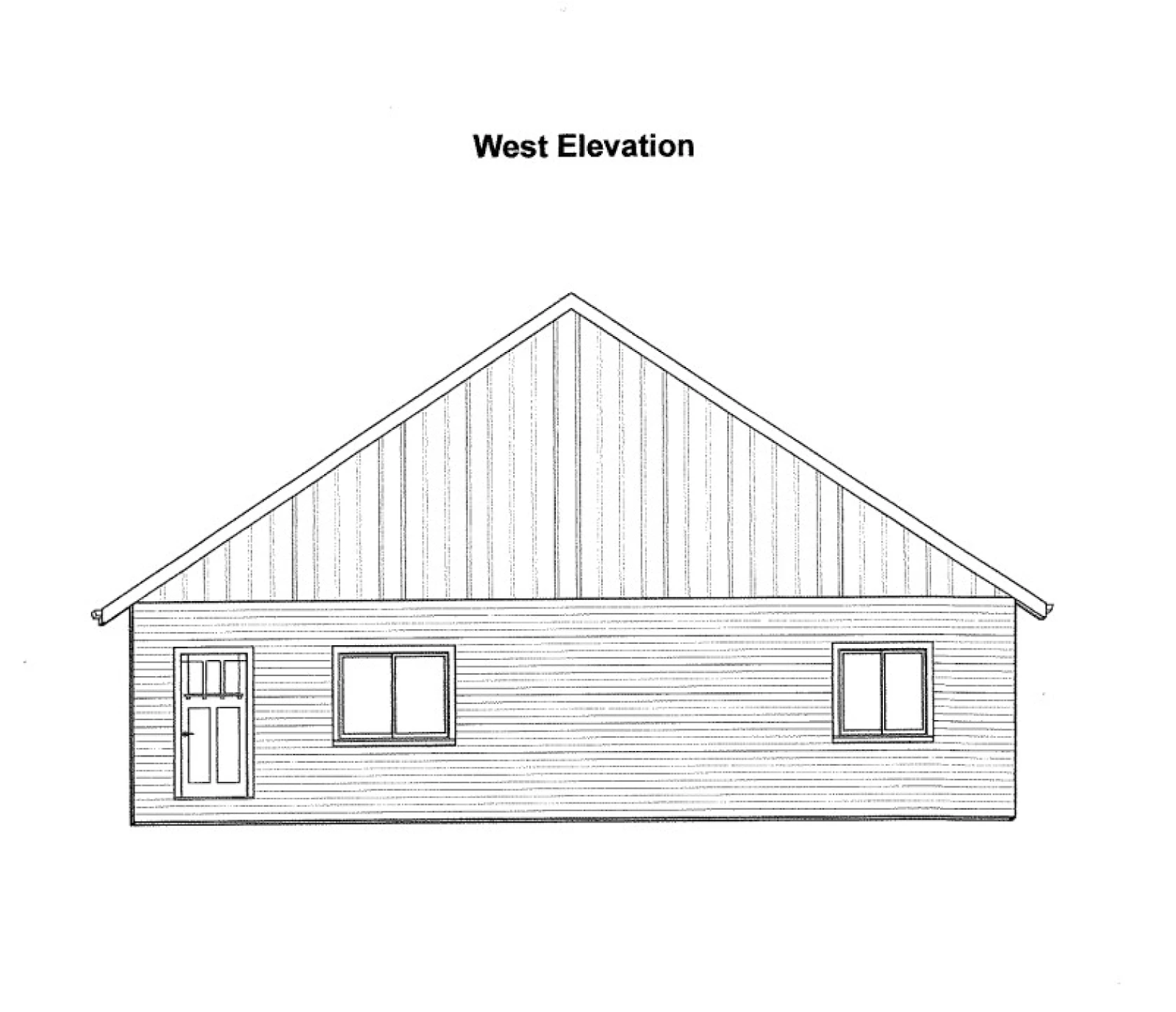
Here are what the homes adjacent to this new strip apartment look like and here’s what the new building will look like as viewed from the street. It’s hardly subjective to say that what is being proposed looks nothing like what is currently there. Now, maybe we don’t care (though we should), but there is clearly an established style and one of these things doesn’t look like the other.


If we want more density, the density we permit can’t look like a foreign invader. It needs to blend with the neighborhood. Again, we can not like that—we can think that these neighbors are whiners and flex our power to force these buildings down their throats—but I don’t find that strategy very pragmatic. Or fruitful, especially when a more respectful and productive approach is so easily available.
It's both reasonable and not at all difficult to require what is built here to look like a house instead of a bulk storage unit.
I was quoted in the local paper as saying, “We have created an ordinance that essentially gives us the worst style and development of [the neighboring suburban city of] Baxter in terms of density and placement, and then goes and tries to mitigate that by having screening that attempts to cover up the bad design.”
The details behind that insight are simple. For starters, the lot we’re examining is 110 feet wide, but we’ve created a minimum lot width in our code (65 feet) that prohibits subdividing that any further. Allowing a narrower lot size would allow for more flexibility of design. Instead, this suburban lot dimension requirement—along with the setbacks, which are also suburban in dimension—means we’re requiring the artificial bulking of units into one, large structure.
Like most suburban codes, our code focuses on front yard setbacks, but gives no consideration to how those setbacks relate to adjacent properties. Urban Design 101 is to line up a row of buildings with each other to at least begin to create a sense of place. This diagram by Leon Krier illustrates the difference between an urban and a suburban design approach. With the density we’re asking for, a build-to line, with consideration to adjacent properties, would be far more productive than our current suburban setback approach.
Our suburban-oriented code also gives no consideration to how the building is arranged or oriented on the site. We have some diagrams in our code that show an ideal scenario, but those aspirations are undermined by our setbacks, width, and density requirements. We provide no concrete guidance on how homes are to be placed—even though we easily could—and so we get the storage-unit style of placement presented in this application.
We require parking spots, but again we say nothing about their placement, allowing them to be lined up along the lot line. Instead of adjoining backyards or a backyard with a structure, one neighbor now has a backyard that is a parking lot. The other gets a 110-foot vinyl wall. Neither will attract the kind of investment the city wants in this neighborhood.
We shouldn’t require parking at all, but if there is parking provided, we should require that it be placed behind the building consistent with all the other homes on this street. That’s not subjective nor onerous. It’s basic design.
There are a couple of places in our code where we have tried to create a minimum architectural standard to ensure some blending of the density into the neighborhood, but our approach merely highlights our insincerity in a way that invites gimmicks and half-measures.
For example, our code says that apartments like this one “shall be designed to create visual interest through a variety of materials, colors, textures, installation direction or other characteristics that create articulation either between units or floors.” I know what is meant by that, and I can envision what it should look like, but what we’re getting instead is a shift in the vinyl siding from horizontal to vertical for a modest portion of the facade. That’s pathetic.
The reaction here from typical zoners is to find that this standard isn’t clear or strict enough, but that’s not it. The reality is that this “visual interest” standard is trying to compensate for the hot mess that our other bulk and density standards have induced, and it’s not up to the job. Thus the gimmicks. We need to address the placement and bulking of structures and then this half-hearted “visual interest” stuff becomes unnecessary.
We also require that the apartment building “be sited, oriented, and landscaped to produce a harmonious relationship of buildings and grounds to adjacent buildings and properties.” Again, if this standard doesn’t apply to the awkward orientation of this building, who are we kidding? Zoners who write ordinances love to put this kind of language in them, but it’s almost always worthless because either nobody wants to adhere to them or, as in this case, we claim that adhering to the obvious language and intent is “subjective” and we just ignore it.
Anticipating the negative design, placement, and orientation that our ordinance induces, we have spent an inordinate amount of time and energy creating screening standards to buffer ourselves from the byproduct of our regulations. The nature Band-Aid of having “one (1) shrub planted for every five (5) lineal feet of parking lot perimeter” or “four (4) shrubs per dwelling unit” may eventually grow to hide the worst offenses from view, but is that what we aspire to? To screen our way to tranquility?
As one of my colleagues stated, “I wish everybody designed these amazing, beautiful-looking buildings … but that just isn't the nature of building in today's climate. It isn't the nature of construction, and it certainly does not appear to be the general nature of progress, especially in high-density construction.”
I don’t wish, expect, or believe we should even attempt to regulate “beautiful-looking buildings” into existence. Yet, what makes a building fit into a neighborhood has little to do with adornment or style and everything to do with building bulk, placement, and orientation, which we do regulate. There is nothing requiring high-density construction to be ugly except for our own ordinances.
Let me be clear to all of our readers who might be thinking that I’ve got an anti-density NIMBY streak in me: I would love to see eight units on this lot (instead of the proposed five). Here’s a schematic by John Anderson that shows the front view (left) and side view (right) of a very nice fourplex, one with an affordable, ADA-accessible, ground floor unit. Two of these fourplexes would easily fit on this property. If they aligned with the adjacent units—which they would complement well—and had some basic urban landscaping (not suburban screening) with the parking placed towards the rear of the lot, these eight units would be a tremendous addition to the neighborhood.
Most importantly, I don’t think the neighbors would object. And, if they did, it’s not going to be on the grounds that this building wouldn’t fit into the surrounding neighborhood.
I know there is a large body of hyper-YIMBY thought out there that loathes any friction on building new housing and hates fighting with neighbors over zoning regulations. I’m very sympathetic to that viewpoint. Even so, it’s not difficult to have good urban design, the kind that respects neighbors and the neighborhoods they live in. It’s actually a lot less work than the processes we use to administer the suburban zoning codes we have today.
Cities need to allow neighborhoods to thicken up, to evolve and mature over time. To do this, they need to get the zoners out of the way. They need to get rid of their modified version of a suburban development code, the one they bulked up with parking, screening, and other suburban Band-Aids—inconvenient rules they largely ignore, anyway. They need to stop their fetish for allocating density through complicated and arbitrary zoning regulations. These are not the ingredients for building great neighborhoods.
Instead, we need to simplify our land use regulations down to the essentials necessary to get good urban form in the next increment of development intensity. Get the form right, and everything else will work itself out over time. Mess up the form, and we’ll prove the obvious again and again: there is no amount of regulation, process, and review that can overcome a bad zoning code.


Advocates must adjust the way they talk about city planning. Overuse of jargon and a strict focus on logical debate alienates people, but focusing on the concrete benefits of better urban design — or, even better, showing those benefits — can make change more appealing.