How to: Rain-activated art (aka Rainworks)
Months ago, this video was sent my way by a handful of people who know I'm into this stuff:
What a cool idea! I put this on the backburner to experiment with locally. Thank you to Peregrine Church of Seattle for the inspiration.
That backburner was lit when I was asked by some rad public art activists in Moncton to participate in their inaugural public art festival using rain-activated art.
It took me a while to decide what to do and how to do it, but the process is remarkably easy once you know what to expect. I'm by no means an expert and have no training in stencilling, but this process has done the job for me on more than one occasion. Here's a how-to if you're interested in trying your own rainworks. It's pretty much the same for spray chalk.
#1 Pick a Design
This is the most important step. Personally, my creative process is driven by at least one of four goals:
- To make a point.
- To amuse.
- To educate.
- To connect.
The key is to churn out a lot of ideas and finding a trustworthy sounding board. I usually run through at least a dozen concepts before I find one that feels right.
“I am the Poem of Earth, said the voice of the rain,”
In this case, I settled on connection via poetry because it wears so well on a rainy day. And I chose words vs. images because I liked the idea of the rain speaking to you, or the pavement speaking to you. I always try to put myself in the shoes of someone who will be encountering the piece. How will they be feeling already and how will this piece make them feel? There's no real way of knowing, but you can empathize. From my experience, rain makes you feel either grateful and alive, gloomy and poetic, or annoyed. I wanted this piece to evoke from urbanites the gratitude and awe a farmer might feel when the rain falls on parched land.
The spray is setting after stencilling. On a rainy day, it will appear the reverse (dry letters, wet ground).
The verse I connected with comes from Wendell Berry, an inspiration of mine:
I was born in a drouth year. That summer
my mother waited in the house, enclosed
in the sun and the dry ceaseless wind,
for the men to come back in the evenings,
bringing water from a distant spring.
veins of leaves ran dry, roots shrank.
And all my life I have dreaded the return
of that year, sure that it still is
somewhere, like a dead enemy's soul.
Fear of dust in my mouth is always with me,
and I am the faithful husband of the rain,
I love the water of wells and springs
and the taste of roofs in the water of cisterns.
I am a dry man whose thirst is praise
of clouds, and whose mind is something of a cup.
My sweetness is to wake in the night
after days of dry heat, hearing the rain.
#2 Sketch it out!
Make a few thumbnail sketches of how you want your design to look. Analyze your dimensions and try shading in what will be cut out when it becomes a stencil. How will you manage the Os and As and Rs, etc? (I got around this with a filled-in type because I didn't want to keep track of little pieces.) Your design needs to fit onto stencil sheets, so map it out in advance. In my case, I was doing lettering. If I had more time to work on this, I'd have developed my own set of hand-drawn letters, turned those into tracers, and then made stencils. Given my limitations here, I found an open typeface that I liked and did some mockups on paper, then the computer, then back to paper.
Mockup. Black = stencil cutouts.
Figuring out sizing.
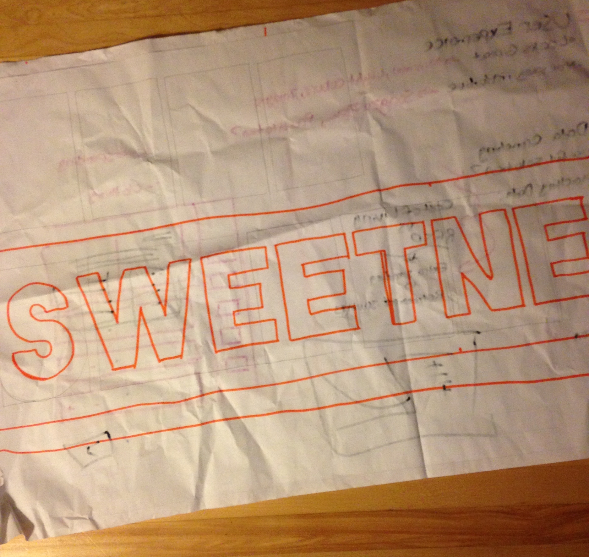
A word of warning: dealing with text often requires quite a lot of calculation. The stencil material I use is quite expensive, so being economical with space is worth the trouble. Here, I knew "sweetness" was the longest line width in the piece and I needed that to fit within two stencil sheets. What followed was a trial and error process of blocking out the letters by ratio and estimating how much margin was necessary. There's probably an easier way to do this, but just make sure that you measure twice, cut once!
#3 Draw to scale and trace.
Gridded flip-chart paper works especially well for this. In my case, it was really convenient that I could actually print out the letters to scale and trace them directly. Were I not so lucky, I'd have sketched everything out full-size on flip-chart paper. Once that's complete, trace over it onto your stencil material. I use something called Mylar for stencils, which you can find at your local art store. It's made of plastic which means it can withstand multiple coats of your spray (chalk, paint, or hydrophobic). If you only had to use a stencil once, you could probably get away with cardboard or some other recycled material you've got lying around. The nice thing about Mylar is that you can just throw it over your paper design and treat it like tracing paper.
#4 Cut out your stencils.
Simple enough - grab a piece of cardboard to protect your cutting surface and take an exacto knife to your stencils.
#5 Align
Everything look good? This gives you a chance to prepare for things like wind, errant spray, and missing pieces. Lay everything out and forecast what could go wrong. Prepare for it, because you don't want to be flustered or delayed when it's game time. In my case, I had left little margin around these stencils in order to save Mylar. So I knew I'd have to bring all sorts of cardboard and newspaper to protect the ground around my stencils from overspray.
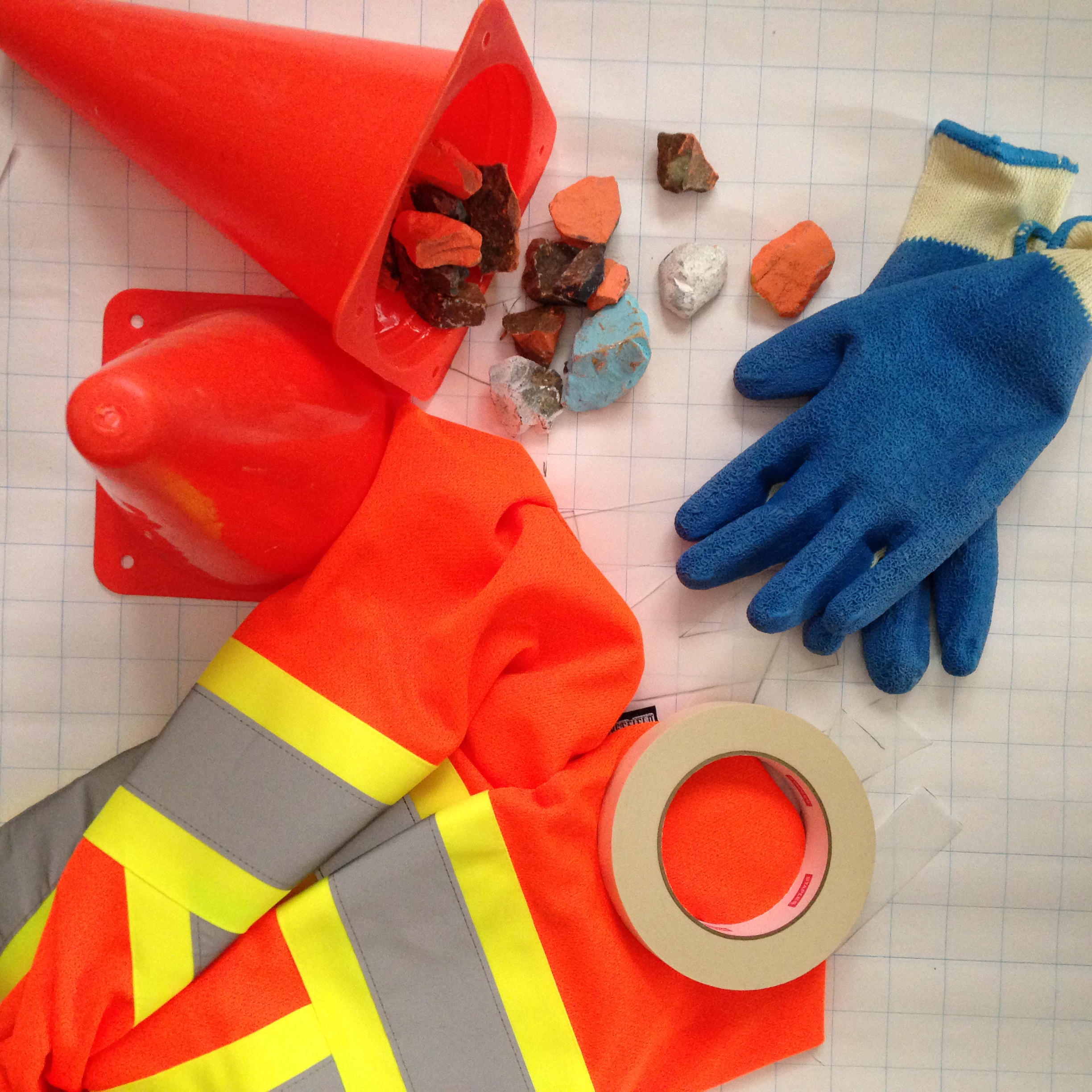
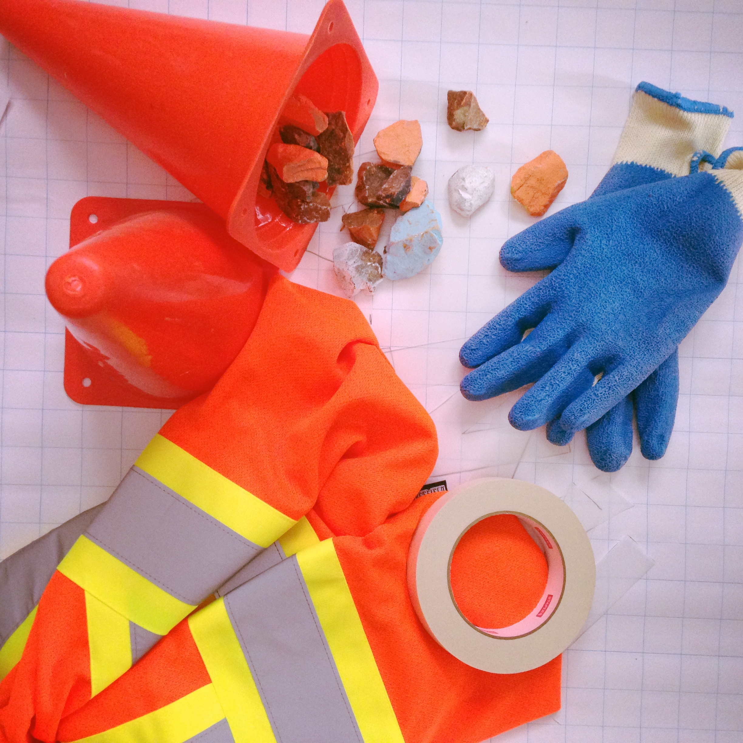
#6 What to bring
- A reflective work vest and pylons - people assume you're a professional when you've got this gear. It's great for your safety and that of your piece, but also makes you look legit.
- Tape (and scissors) - always have them with you. You will need them for something or other.
- Lots of rocks or other little weights - wind will become your worst enemy when stencilling outdoors. Have plenty of anchors on hand.
- Gloves - keep your hands clean and dry for when you need them to be (ex. using a camera).
- Broom - to remove debris from your stencil area before you get started.
- Paper/cardboard/misc. materials to block off the ground around your stencils.
- Your spray of choice. I'd recommend Montana Spray Chalk for colour designs. For rain-activated art, you are looking for hydrophobic spray. Here, I had to use NeverWet (available at Home Depot) because it was the only kind I could get on a deadline. According to the Seattle rainworks guys, NeverWet will not dry totally transparent and is much worse for the environment than a competitor called AlwaysDry. I tried to get this stuff from the outset, but the shipping was slow and unpredictable. It did not arrive in time. So if my experience is any indication, give yourself at least three weeks for shipping. [UPDATE: May, 2016 - The Seattle rainworks people have now commercialized this spray with their own branding and shop called Invisible Spray.]
- I was hoping I'd be able to test the design out with a watering can, but couldn't find anywhere to fill it on site (and you're supposed to let the hydrophobic spray set for 12+ hours)
#7 Get to it!
Pick a site, clear it off, lay out your stencil, weigh it down, and follow the instructions on the label.
#8 Watch it rain!
Unfortunately, I haven't had the chance to see my rainworks in action yet because I had to get back to Fredericton before it fully set. If you live in Moncton, please take a picture of this in the rain and send it to me!
GRACEN JOHNSON is a communications designer living in The Maritimes. While she finished her MPhil in Planning, Growth, and Regeneration in 2013, she has never stopped studying the city. Gracen thinks of her day-to-day as participatory action research, diving into the question of how Strong Citizenship can transform a city. She wears many hats trying to crack that nut herself, including as the designer and coordinator of an accelerator for small businesses that build community. She also freelances around the vision of "Projects for Places we Love" and has a video blog called Another Place for Me.
This year, Gracen is sharing field notes on her experiences with Strong Citizenship. In this regular column, you'll get snapshots of life as a friendly neighbour in a quintessential Little City that feels like a Big Town.


