A Simple Guide to Architectural Rendering
Do you ever wonder what that vacant lot in your downtown would look like filled in with a building? Or perhaps if that one story building near your office had a few extra floors above it? I do, and I often want to show others what I’m visualizing in my head. I've considered taking a photo and sketching over the top of it, but I’m not skilled at perspective drawing so the result would not look good it. Instead, I've come up with some ways I can use the computer to do most of the work for me.
I went from an idea to a 3D rendering of a site in about 12 hours. I'm going to share what I went through, since it'll be useful for anyone who wants to do 3D rending of their own projects. I’m not an architect, artist, or trained in any of this. This is the layman’s guide to architectural rendering.
I want to infill this corner lot.
Sketching
The first step is to choose a site. The site I chose was a vacant lot that was 25 feet by 65 feet.
The next step is to come up with some basic measurements for the building - the number of floors, and the height of each floor. I chose to do four stories that fits in with the scale of the area. I like 11 foot tall ceilings and 1 foot interstitial space, so that’s 12 feet per floor. I noticed that the ground floor is slightly higher on many of buildings, so I made the ground floor 2 feet higher (giving me an extra 2 feet to do a decorative transition between the ground floor and the upper floors, as many buildings do.) I made the roof slightly shorter (10 feet sounds like a nice round number.) Add these numbers together, and my building from ground to rooftop would be 60 feet tall.
1. Do a rough sketch.
Let's grab a pencil and paper and sketch out the design of our building. You'll need to pick a scale to draw at. The scale needs to be small enough to keep the entire image on the page, but big enough that you have room to fill in the fine details. I was going to go metric, but I had a ruler with useful 1/32 inch notches so I went with a scale of 1 inch : 8 feet.
The 25x60 foot front side of my building with guidelines dividing the floors and placement of the doors and windows.
2. Add guidelines.
Knowing our scale and dimensions, we should sketch out some guidelines. Draw lines where the floors are divided. I even added vertical lines where the columns of doors and windows will line up.
3. Add design elements.
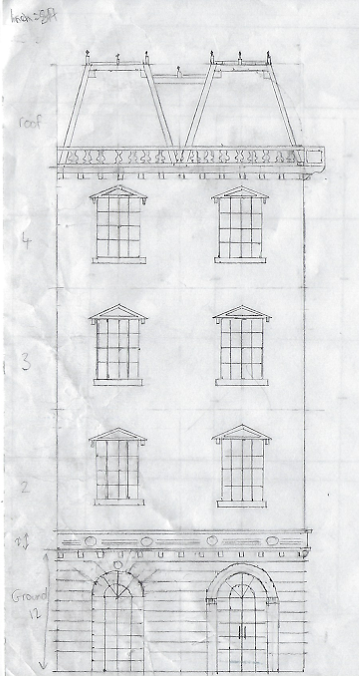
Now it's time to go outside and look around at real buildings and copy the elements you like. Look at the windows and doors. If it's a multi-story building, notice how there's often a transition between the ground floor and the upper floors. Look at how those buildings deal with framing different elements and dealing with corners.
As an unintended consequence, now everytime I see a building I am trying to look for patterns and ratios in their elements to see how they answered the same questions I had to when I was sketching my building
Use your ruler and guidelines to line things up so they are symmetric and balanced. Come up with templates and common measurements you can reuse so there is consistency. For example, I noticed many real buildings have ground floor windows that are twice as tall as they were wide, but the very top is arched. I copied this for my ground floor windows. Remove the semi-circle at the top, and the window has a ratio of 1:1.5. By reusing common ratios and measurements, we decrease the chance of things looking out of place.
I noticed that many buildings I referenced were infilled with details of lions and floral patterns, but, I’m not a good artist so I stuck with geometric patterns I could not get wrong with a ruler.
Front of my building done. (Sorry about the page being crumpled. Our cat kept attacking my sketches.)
4. Repeat for side views.
Now repeat for any side views. I'm fairly slow at this; each window took me a good 15 minutes to draw, and by completing one side I had a fairly good idea of what the other side would look like because I'm going to be reusing all of the same elements, so I decided to be lazy and not waste my weekend and just place markers on the side view of where my elements would go.
I left out the detail on my sideview and instead just left guidelines where things would line up.
Modeling
It’s now time to turn this into a 3D model. I chose SketchUp because it’s free and easy to use. I have dabbled in 3D modeling before, but only making basic shapes, so this is my first time making anything in SketchUp. I found SketchUp very intuitive.
1. Model the front of the building.
Start by modeling just the front of the building first—recreating your front-view sketch in SketchUp. I first started by using the pencil tool to draw a 25 foot line across the ground (you can get exact measurements in SketchUp by starting to draw then typing in your measurement such as 25'), then a 14 foot line into the air. Loop it around (25 feet left, 14 feet down) and SketchUp fills in the shape with a face. I repeated this for each of my floors until I had something that looked like my initial paper guidelines.
Drawing the windows. Don't waste time building the same thing twice; just copy and paste each element.
2. Add lines and design elements.
Once you have the blank front face of your building, use the pencil tool to recreate your sketch in 2D. Having the sketch done on paper first should make this straight forward as you have the measurements of all the lines you need to draw. The measuring tape is your best friend. It allows you to place guidelines that the pencil will snap to without actually drawing lines you have to erase later.
Once you have a shape you can use the push/pull tool to add some depth. Only build one of each element such as a window, and save yourself a lot of time by copy and pasting in the rest of them. Watch a ton of YouTube videos if you want to learn how to do something (I watched videos of people using the Arc and Follow Me tools to create balusters, like this one.)
Adding in detail. The measuring tape guidelines (dotted lines) are your friend.
When you actually see the result in 3D, you might find some things don't work as well as you thought it did when you sketched it on paper. I changed the frame around the door once I saw how it looked in 3D.
The front side of the building is just about done!
4. Complete the sides of the building.
For the side of the building, draw a line starting from the bottom corner of your existing wall back into the scene. Create guidelines for where everything should go. Filling in the side should be mostly copy-paste-rotate.
My ground level wall is complicated so I cut it into pieces I could paste and snap together.
The finished model without any materials.
5. Apply materials.
It's now time to apply materials. Open the materials window and use the paint bucket tool to paint faces. I used the built-in materials that come with SketchUp, but you can create custom materials by doing a Google image search for '[material] seemless texture' and loading in the image. Painting the faces is somewhat tedious. I regret not having the foresight to do this from the start when I could have copied and pasted the windows with materials already applied, rather than going through and painting them one by one.
Our fully painted building that is ready to go.
Rendering
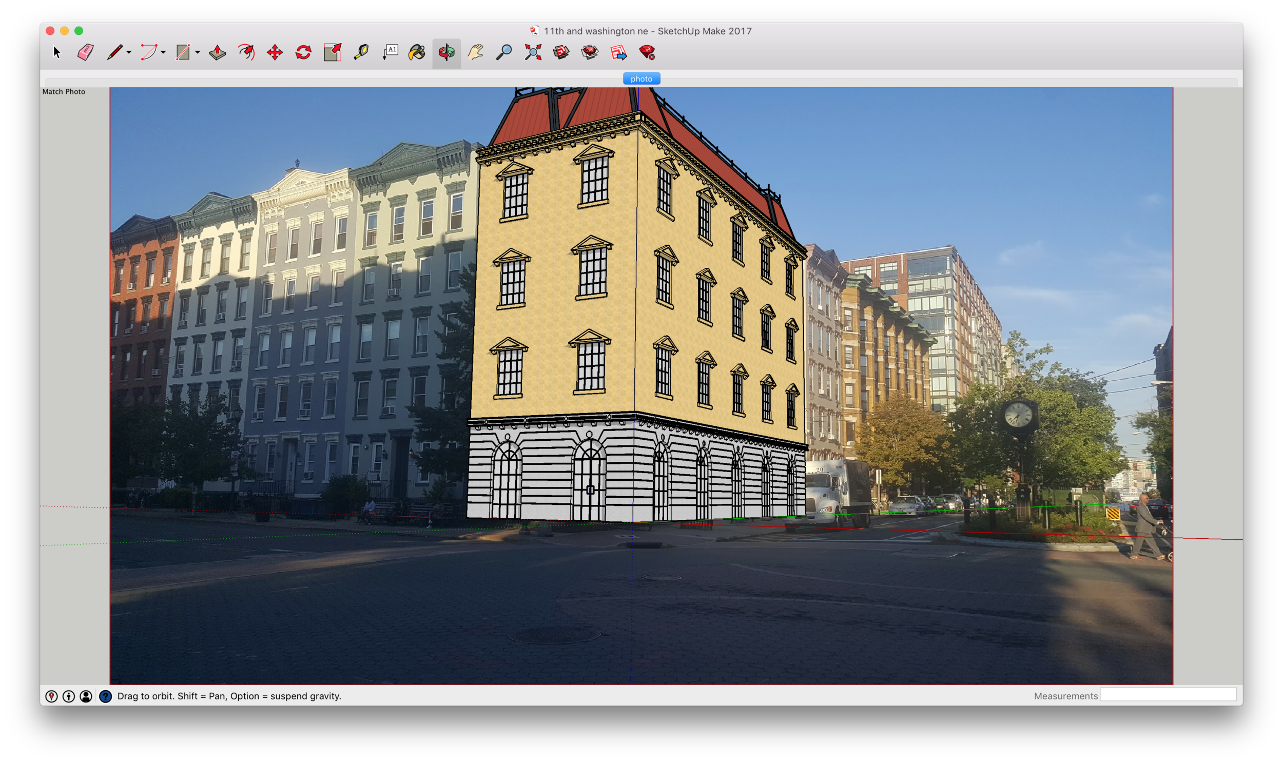
SketchUp has a cool feature called Photo Matching (find it in the menu under Camera > Match New Photo) that let's you import a real photo. You then line a few reference lines with straight lines in your photo and SketchUp matches the perspective with that of the photo. This is where you can load in a photo of where you'd like to see the building - in my case, the vacant lot.
Aligning my model with the photo. Notice the red and green reference lines.
My model imposed over the the vacant lot in the SketchUp editor.
SketchUp doesn't come with a renderer, other than what you see in the editor, which doesn't do realistic shading or high-resolution exports. There are a ton of third party renderers out there that integrate into SketchUp. I used Twilight Renderer as I found it worked out of the box without any tweaking.
The final result. I replaced the sandstone texture with one slightly better than the stone material that SketchUp comes with.
Conclusion
Sketching, modeling, and rendering a building is time consuming, and I'm definitely no professional (in 3D modeling or in architecture.) It took me about 12 hours from start to the finished result. But, the process isn't complicated or difficult if you break it into easily maneagable steps. Anyone with the time to spare can learn to draw and render architecture - whether it be to share their vision, sell a project, or just for fun.


