2022: The Year in Maps and Charts From Urban3
If a picture is worth a thousand words, then a good map, chart, or other colorful visualization may be worth a whole library. After all, nobody engages in their favorite neighborhoods or towns by reading about them—we walk around in these places, feel them, and look at them. Appearances can sometimes be deceiving, so it’s useful to have a look that shows us not only what our cities look like, but how they operate, pay their bills, and, hopefully, endure for tomorrow’s denizens to enjoy them. After all, the most useful roadmaps don’t just show us where we are. They show us where we’re going and how to get there.
At geoanalytics firm Urban3, we get to produce a lot of maps, charts, and other data visualizations. Here are some of our favorites from 2022, each one of which we believe has an important story to tell about where we’re going and how to get there. The breadth and variety of communities represented here show a snapshot of our great, big country, divided by topography, ecology, economics, and demographics. What these images reveal, however, are underlying mathematical truths about the places we choose to develop and inhabit, and how those choices make our towns weak or strong.
Analysts’ comments have been edited for length and clarity.
Billy Cooney, Analyst
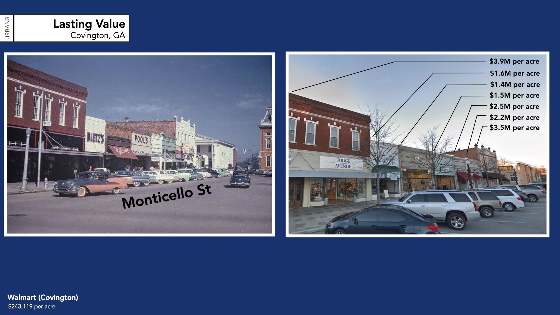
This graphic is part of the "lasting value" section that we do for every client presentation. Here we see Monticello Street, which runs along Covington Square in the center of downtown Covington, Georgia, an exurb of Atlanta. The photo on the left is a historical view of the street from the early 1950s, while the photo on the right is the exact same block today. You can see how long those modest, traditional buildings have been there—and how long they have been productive for the city, from a tax generation standpoint. Most city leaders and residents are shocked to learn how financially valuable and viable these older buildings are, but the data tells the story. It’s a reminder that traditional methods of land use and design worked for a reason.
Lanier Hagerty, Analyst
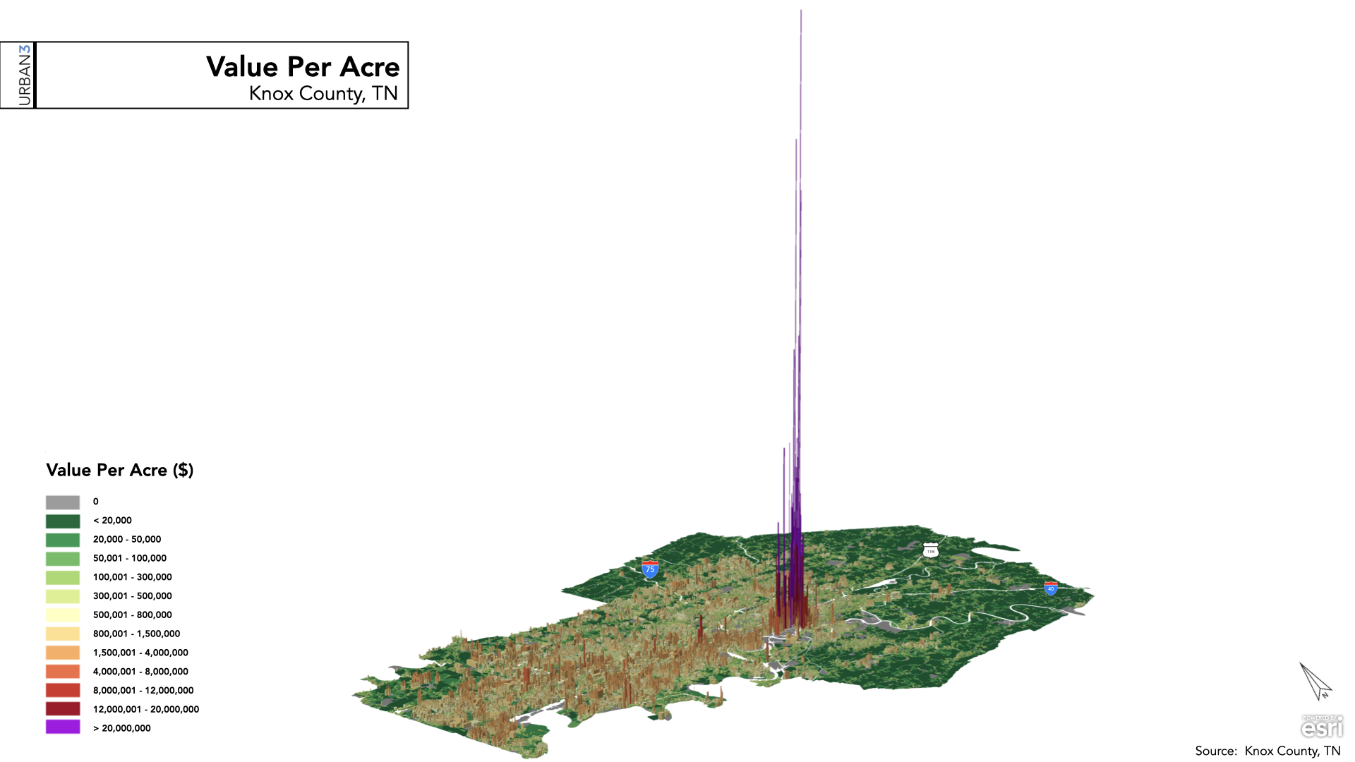
These value-per-acre (VPA) graphics are a standard visualization for Urban3, and show at a city-wide scale how much potential tax generation is available to a local government on a parcel-by-parcel basis. These particular graphics are from a project we did for Knox County, Tennessee, as part of their Comprehensive Planning process. We find them exceptionally useful because you don’t need to be a land use professional, city planner, or urban designer to interpret them—and most politicians are none of those things! They are visually legible in a way that helps the viewer immediately understand what they mean: traditional, dense, walkable urbanism is more financially productive on a yearly basis than developments which both require massive public subsidies and don’t yield as much on a per-acre basis.
Nathan Steddom, Analyst
Working with Harris County, Texas, was my first project at Urban3 and creating this VPA map was a powerful introduction to what we do for county governments everywhere. I've spent a lot of time in Houston, so being able to see the city through this lens tested my assumptions about a place I thought I knew well. A lot of what we try to do for clients is give them the tools they need to challenge their own biases and preconceived notions about their communities. VPA is one such tool because it shows how different development types contribute to the financial viability of Harris County—one of the geographically largest, fastest-growing, and third most populous county in the country.
Adam Carr, Analyst
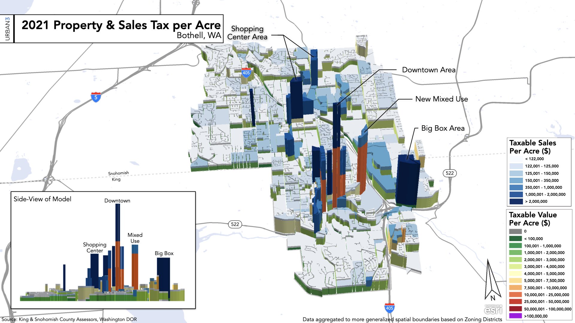
One of the things we have to learn at Urban3 is that different cities and metro areas fund themselves in different ways; some parts of the country rely more heavily on sales tax revenue, while others depend more on property taxes, income taxes, or other sources. For Bothell, Washington, a rapidly growing suburb north of Seattle, we had to synthesize and incorporate several data sets to give our clients there a comprehensive look at their financial situation. This map “stacks” property tax value and taxable sales value to show what a series of tables, no matter how detailed, could not accomplish.
Ori Baber, Ph.D., Analyst
We obviously do a lot of work with local governments, but Urban3 also often has the fortunate position of helping private developers try to make the most financially sensible decisions for land where they are making substantial investments. This was the case in Arlington, Texas, part of the Dallas–Fort Worth metroplex, where sprawl is commonly thought of as a way of life. Our developer client engaged us to walk through some scenario planning that would demonstrate the financial impact that their master-planned communities would have on the region’s tax base. Doing so through an animation allowed us to take this a step further and show them what that value would look like over an extended period of time.
(Download the full PDF here.)
Taylor Schenker, Analyst
We generated a series of poster boards for the University of Chicago’s Conference on Housing Zoning and Land Use, which was a bit different from our usual work, but every bit as useful and revealing. This project was fun, as I got to really use my creative muscles, but also because I was able to collaborate with Dr. Emily Talen, a renowned professor at the University’s College of Urban Planning and Public Affairs, whose research looks deeply into what various land use and development decisions are doing to the supply of housing units near mass transit. This is another example of how our work can be used to reveal something that local leaders might not otherwise see, but which they can now use to make more sensible long-term policy choices.
Leah Handwerger, Analyst
The delicate relationship between population shifts, land use patterns, and the effects of climate change became a major focus for Urban3 in 2022. Every week seemed to bring some new, depressing report about how quickly our planet is warming. Urban3 is interested in understanding climate’s impact on how we live and work in cities—for instance, when rising sea levels consume more and more of the land cities need to generate the taxes, how will they fund essential services? One of our tools in this work is to examine the movement of people, particularly in climate-vulnerable areas. This flow distribution tool shows the in-flow and out-flow migration of Miami-Dade County. The first map shows domestic out-flow (where Miamians are going) and the second map shows domestic in-flow (where Miami migrants are coming from). We can see a result of a net population decrease of 47,378—but when we incorporate international data, Miami-Dade's population stabilizes. The lesson: Although the county is losing its domestic population, it could become a receiving city for international migrants escaping even more severe climate impacts.
Tia Decker, Analyst
Urban3 consulted on a project in Edmond, Oklahoma, for a developer who proposed a 26.6-acre mixed-use development called Liberty Park. While we love our public sector clients, it can be fun when developers hire us for the same reasons—to tell them approximately how much it will cost annually to run the development and how much money they will make in return. The cost calculations for this project included the per acre cost for infrastructure operations—water, sewer, and electric—as well as costs for services that are based on populations, such as fire and police. Against that, we calculated the projected revenues, including the per-acre collection of various taxes and fees. Overall, our analysis projected that the projects as proposed by the developer would operate net positive on an annual basis, meaning in this case that local government could expect to to clear around $1.02 million every year from the revenues generated on this site. We compared this to a previous plan for an all-residential development on the same site, which would have been a net negative for local government, costing taxpayers around $900K every year. In the graphics, the net-positive model is shown in black while the net-negative model is in red—you can think of it as money literally draining out the bottom of a city. What we found in Edmond is similar to what we find all over the country: Moderate to high-density, mixed-use developments yield better return on the public’s investment, compared conventional, single-use suburban developments. The numbers don’t lie; good urbanism earns more money.
Josh McCarty, Chief Analytics Researcher and Resident GeoAccountant™
Without context or labels, this value-per-acre graphic could tell the story of almost any American city. The compounded economic impacts of urban renewal are so catastrophic as to rival natural disasters and war, and actually outstrips them in measurable ways. The blank chasm reveals the enduring legacy of our country’s racist past: Where there should be prosperity and life, there is blank pavement, as Interstate 94 was carved through the Rondo neighborhood of St. Paul. The gap also serves as an effective trench dividing and disconnecting the city. Over decades, redlining—among a basket of other racist policies implemented by various government malefactors—drained the value from one side of that trench.
Nevertheless, this is a hopeful image. It shows the future of a neighborhood that has begun to heal and grow over the highway. Suspended above it is a plan for the Rondo Landbridge, which will physically reconnect the community while the institutions around it will re-energize the neighborhood’s economy. We should all aspire to create some version of this image in our towns, in which the future catches up with the past.
Joe Minicozzi, Principal
Anyone familiar with our work knows the power of our graphic presentation style, but also what a wonderful team of nerds we are. We love data analysis for cities! Every community we analyze has its own unique story that shines through in its 3-D model, and all of this is a reflection of urban design and policy choices.
In 2021, we pivoted as a team to investigate equity in our home community, Buncombe County. Having practiced in over 40 states, we saw patterns in the data, and our community adopted resolutions for equity and reparations. So we gave our time, pro bono, to test the data. What we discovered was more than mind blowing, and something you can’t unsee. Strong Towns has amplified our work with this interview, and numerous stories through the Just Accounting project. And in 2023, more findings will be coming out. But out of all the hundred of graphics from this one project, this singular graphic of one of the wealthiest neighborhoods in the entire state has struck me as the poster child of the problem and the impetus of the “Mansion Blight” piece I wrote for Strong Towns. There is no amount of logic, data, or common sense that can defend this graphic that shows that 55% of houses in the wealthiest neighborhood are losing value to the tune of a declining $40 million over the last ten years. Bear in mind that our community is a highly desirable destination, and even rich people move here! If there is one graphic that demonstrates the failure of property tax policy, this is the one for me.
Cate Ryba, Chief Operating Officer
One of the things I love most about working at Urban3 is the opportunity I have to speak to local government staff and elected officials across the country on a weekly basis. Whether I am talking to a mayor of a large metropolitan area or someone juggling the roles of planning director, economic development director, and community development director for a town of 2,000, they all have the same things that keep them up at night: How can I do more with less? How can I provide that new park, more affordable housing, and even pave the aging roads, all within our current budget? Many communities are just starting to experience the effects of the Growth Ponzi scheme, while at the same time seeing dwindling state and federal funding. This year, Urban3 had the opportunity to work with the City of Atlanta to catalog and quantify the potential value of the municipality’s publicly owned assets as part of the Putting Assets to Work incubator. As you can see in the graphic above, the city is sitting on a $3.9-billion goldmine without realizing the full extent of the asset’s potential. Just as private individuals and corporations use assets to generate income, local governments can do the same with their assets to achieve public policy goals. We saw the same data emerge from every city in the incubator project, from Lancaster, California, to Harris County, Texas, to Cleveland, Ohio: These communities have untapped wealth that is within local control. As a former city councilor myself, I know that there’s simply no replacement for having factual, current information when making a major policy decision, and I’m so excited for the leadership in these communities who will have these tools at their disposal.
Happy holidays, and here’s to using data, visuals, and storytelling to build more strong towns for many years to come.


What percentage of property in any given jurisdiction in the U.S. is locally owned—and are the implications of those numbers? Here to talk with us about it is Alex Alsup of Regrid, which has made the only complete national parcel map.