Learning From Las Vegas: Academic Taxonomy
This article was originally published on Johnny Sanphillippo’s blog, Granola Shotgun. It is shared here with permission. All images for this piece were provided by the author, unless otherwise indicated.
I just returned from a trip to Las Vegas. I was ready for a little post-pandemic adventure and Vegas is just so easy. It was good to get out into the world again and explore the ever-evolving Vegas metroplex. Inevitably, I found myself going back and referencing the classic text, Learning from Las Vegas.
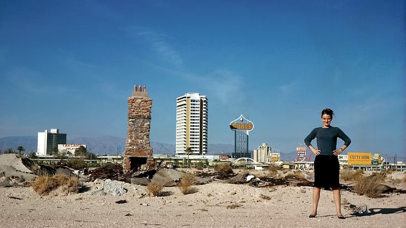
(Source: The Archives of Robert Venturi and Denise Scott Brown.)
In the late 1960s, Denise Scott Brown, a Zambia-born architecture professor, travelled to Las Vegas. She and her colleagues Robert Venturi and Steven Izenour went on to write Learning from Las Vegas in 1972. Instead of dismissing Vegas as a tacky tourist trap like most other academics, the trio treated the city the way serious scholars might explore Rome. They wanted to understand what made the place tick.
Robert Venturi was from Philadelphia and had studied classical architecture at Princeton in an era when modernism was the dominant style. He didn’t necessarily reject the minimal glass boxes of the time, but he did insist that symbolism and ornamentation in architecture were still important. The quotidian landscape was of interest to him, particularly as ordinary objects conveyed social and cultural significance.
(Source: Venturi, Scott Brown and Associates.)
(Source: Wikimedia Commons.)
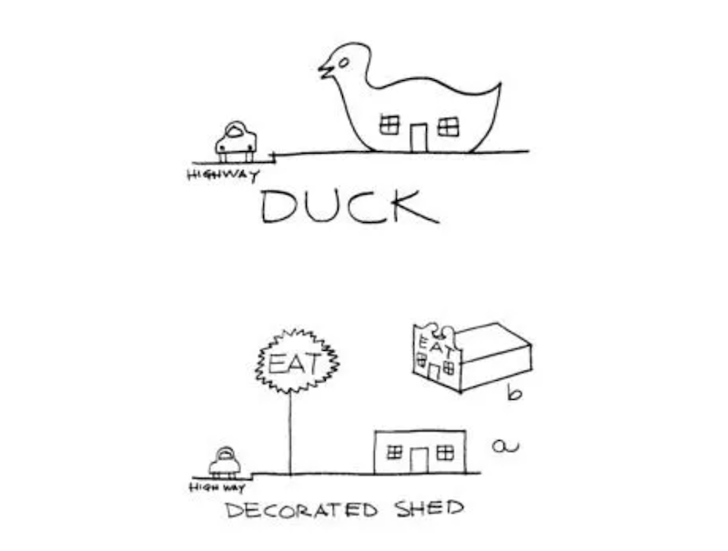
Together, the authors created a scientific taxonomy for what they observed. Some buildings were called “ducks.” These are structures with a physical form that communicates their function—like a shop that sells duck eggs that’s shaped like a duck. The building itself is the sign.
(Source: Wikimedia Commons.)
Other buildings were categorized as “decorated sheds.” These are no-nonsense functional boxes with oversized signage and appliquéd ornamentation facing the street. The signs are effectively the architecture.
(Source: Denise Scott Brown 1965.)
In both cases, the goal of these buildings is to respond to the reality of the dispersed, horizontal, auto-oriented landscape. Buildings need to communicate to a public that exists largely in vehicles traveling at high speed from a distance.
The Las Vegas of fifty years ago was larval compared to what it has become, but the essential tactics and techniques are all still there. Ducks and decorated sheds draw people in from the highway with signs and symbols.
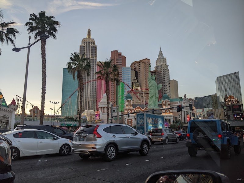
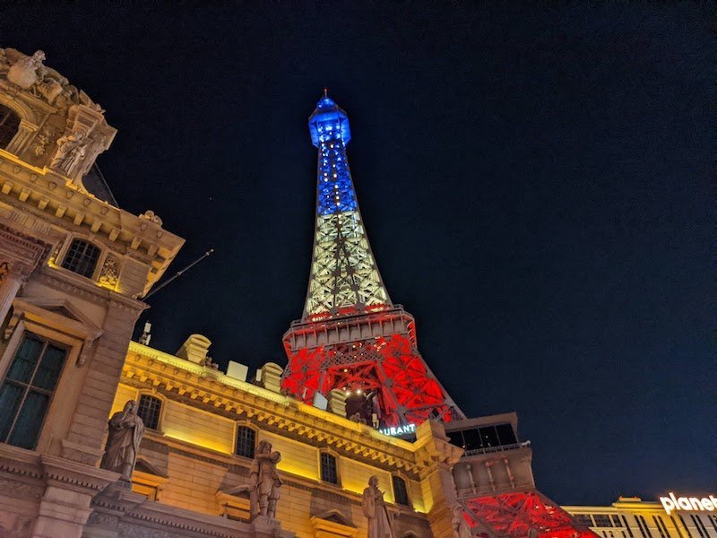
The New York-New York Hotel and Casino and Paris Las Vegas are quintessential ducks.
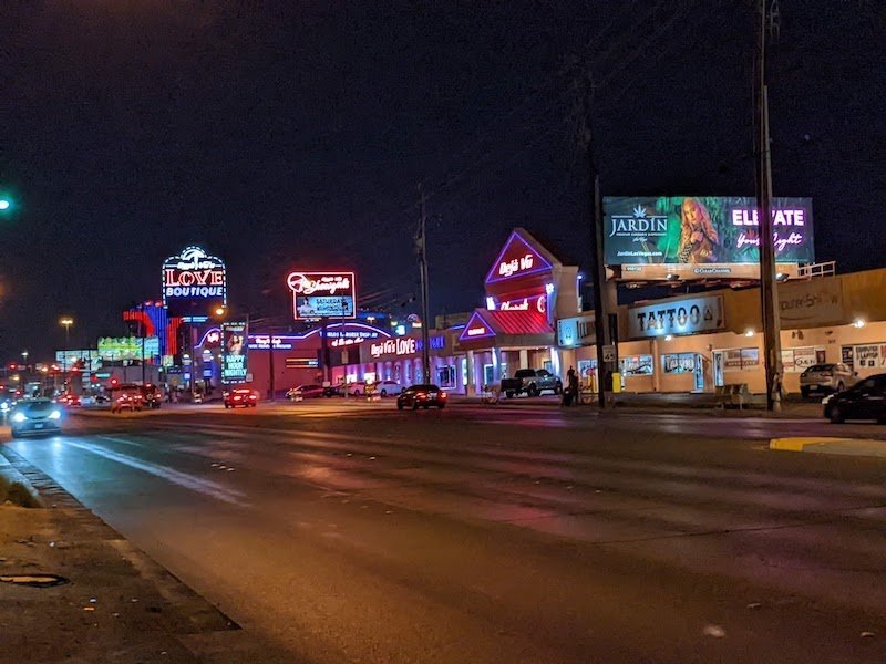
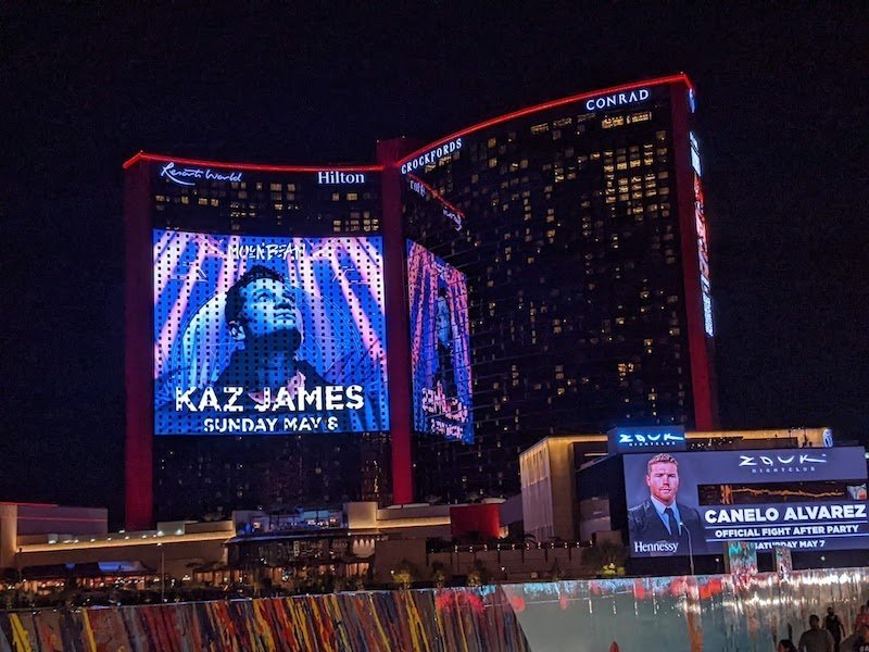
Nearly everything is a decorated shed from the lesser side streets lined with nudie bars to the industrial efficiency of the Convention Center to the electronic facades of glass box hotels.
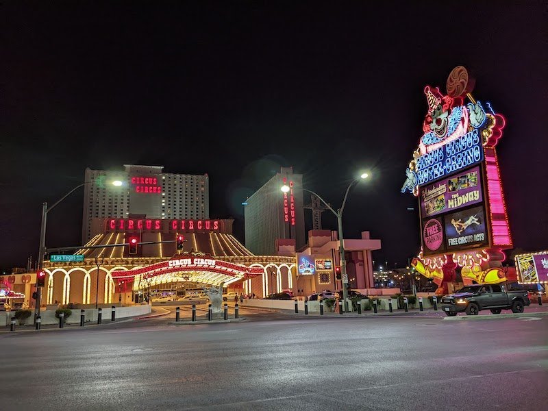
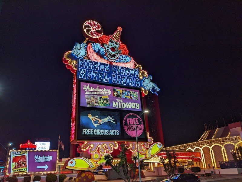
The Circus Circus Hotel and Casino, like many of the structures along the Vegas Strip, manages to be both a duck and a decorated shed. The steel-and-concrete building has the shape of a circus tent while ornamentation has been outsourced to the detached and elaborate signage.
Learning from Las Vegas was never meant to be about Vegas per se. Denise Scott Brown and Robert Venturi were very clear about this from the beginning. Vegas merely presented exaggerated versions of what was happening all over North America in the mid-twentieth century. With time these trends have only accelerated.
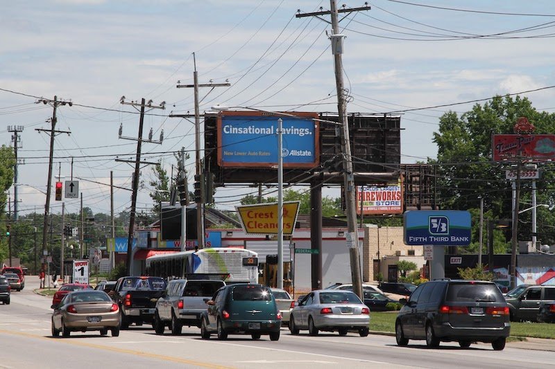
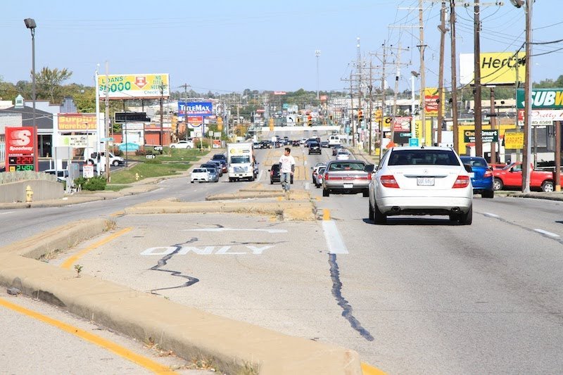
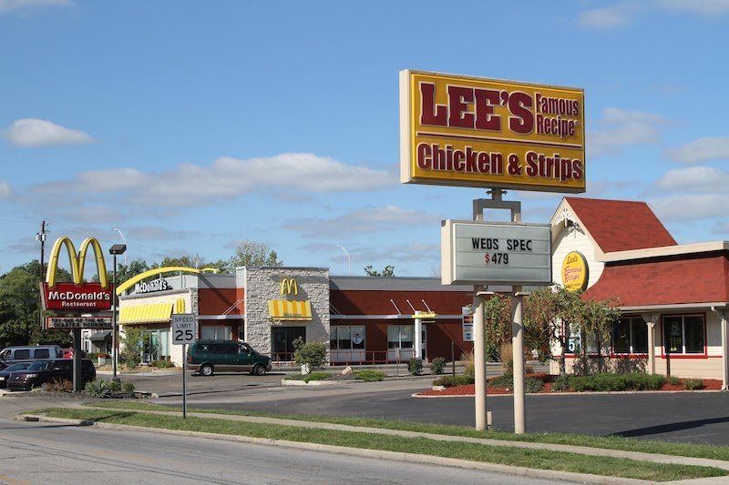
All gas stations, fast food outlets, strip malls, and big box stores are decorated sheds. The architectural syntax and grammar are there, plain to see. Our ubiquitous buildings and public realm look and perform the way they do because they respond to our dominant transportation system and infrastructure. Everything is exquisitely tuned to the car.
Ducks may seem less common, but they’re more abundant than you might imagine. It’s rare to see a brewery’s grain silos embellished as a row of beer cans. But chain establishments use the silhouettes of their rooflines, trademark logos, and branded color schemes to create a ducky association for the public that’s embedded in the architecture. Las Vegas is everywhere.









Varsha Gopal is an architect from Chennai, India. She joins Norm today to discuss discuss two research projects she recently conducted in her city and what they taught her about thriving cities, urban design and community engagement. (Transcript included.)