Transportation Vandalism
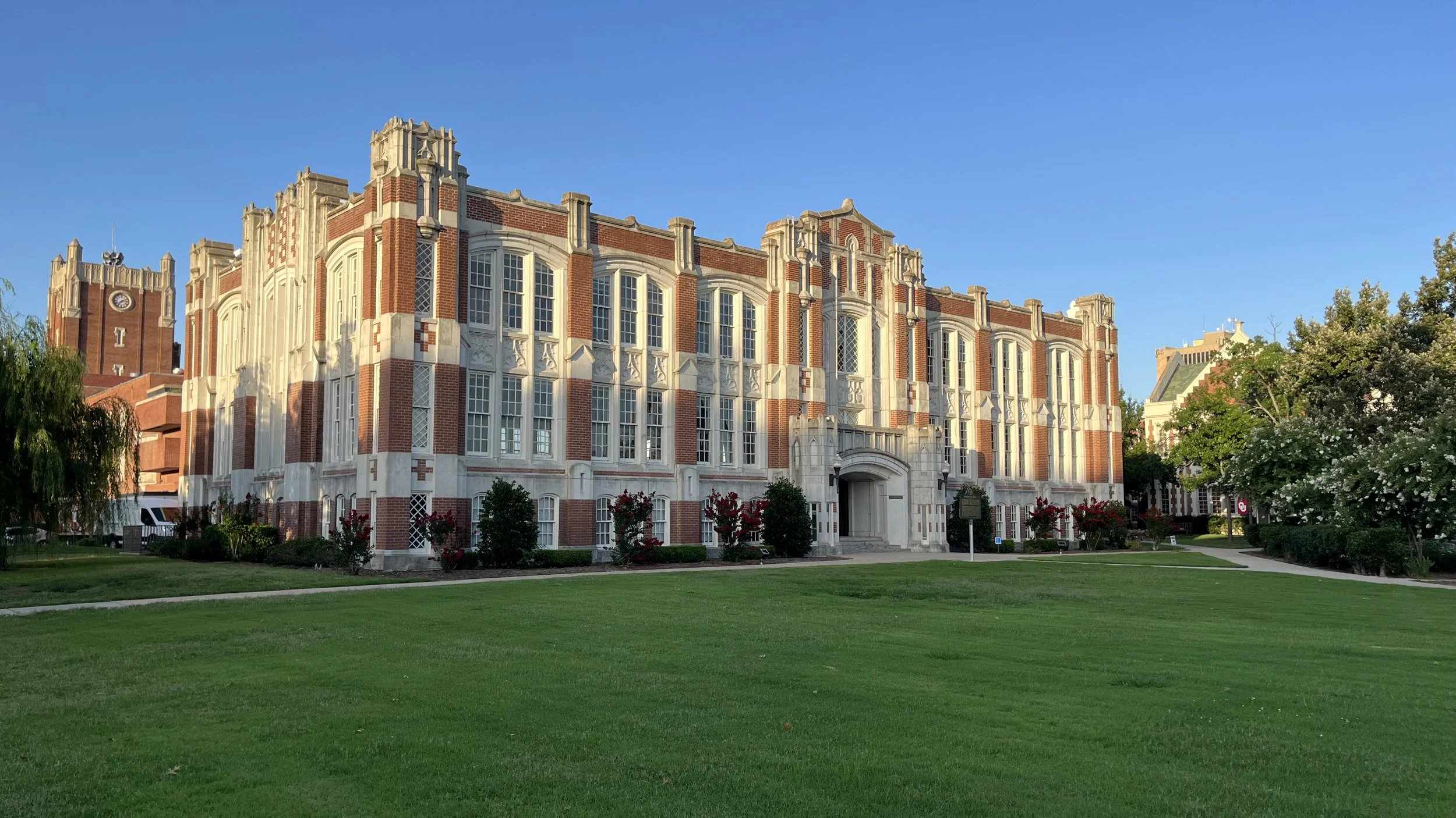
Oklahoma University campus. (Source: Strong Towns/Edward Erfurt.)
Cities are complex, messy places. In addition to paving, landscaping, and sidewalks, there is a lot of “stuff” we need to place within our cities in order for them to function. Power transformers, utility pedestals, backflow preventers, meters, signs, and poles are all necessary elements of a street, but they become an afterthought in the design phase.
I come across these unfortunate eyesores as I travel around the country. I don’t deny that in order for our lights to turn on, our internet bandwidth to throttle open, and for freshwater to flow out of our faucets, we need to have all these things. All this stuff needs to fit into some very tight spaces, but sometimes this stuff seems to be haphazardly placed.
I would like to share an example I observed on my recent trip to Norman, Oklahoma, where I ventured onto the Oklahoma University campus. I was extremely impressed with its unique architecture—the best description for which was coined by Frank Llyod Wright as “Cherokee Gothic.” The buildings follow the collegiate gothic architecture found on other campuses around the U.S., but are further adorned with Native American details unique to Oklahoma.
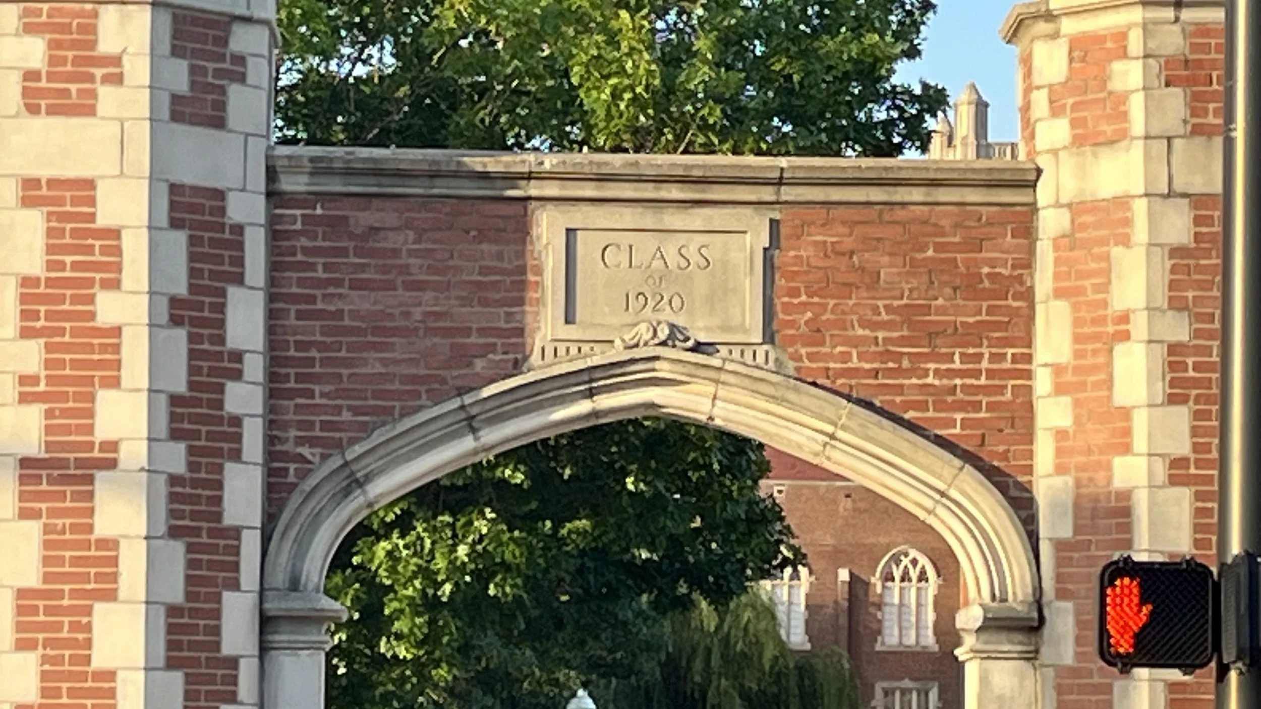
I was particularly drawn to the gateway monuments that stand guard along Boyd Street, as if to keep Campus Corner from slipping onto the university. These beautiful stone and brick gateways were commissioned by the class of 1920, illustrating the deep love the alumni have for this special place. The campus architect and planner should be commended for the preservation of this breathtaking campus.
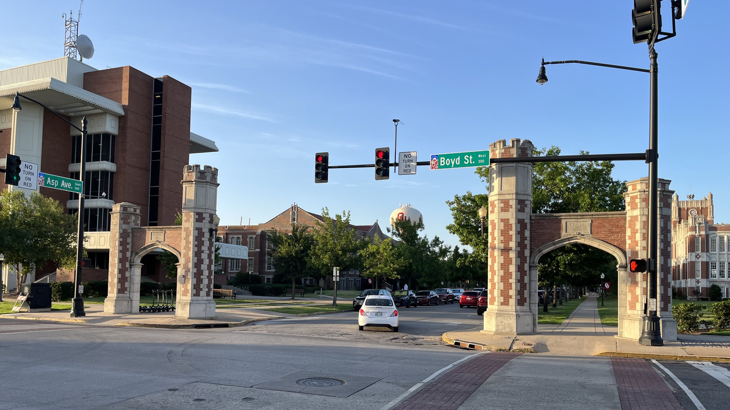
The gateway monuments on Boyd Street. (Source: Strong Towns/Edward Erfurt.)
However, messy parts of the modern city have intruded upon the picture, creating an eyesore that cannot go unnoticed or unmentioned. The traffic engineers here have engaged in a form of transportation vandalism, and it’s even more egregious considering how skillfully designed the university’s gateway is. These monuments from the class of 1920 must now compete for attention with traffic signal mast arms and, frankly, lots of unnecessary visual transportation clutter. I can only assume the traffic engineer of this monstrosity must be a Nebraska alumnus.
The traffic light at the intersection of Boyd Street and Asp Avenue serves many purposes. Asp Avenue is a narrow, two-lane street with one lane of traffic in each direction. Despite only having one lane of travel, not one, but two traffic lights have been mounted across the street. Signage reminds drivers that they cannot turn on red, and a large backlight street sign can be read from over a block away. On top of the mast arm is a street light high above the intersection balanced with a pedestrian walk signal and more signage at the bottom to instruct pedestrians on how to cross the street. All of this was installed just a few feet in front of the historic campus gateway, and repeated on each corner of this intersection.
The engineers have definitely gone all in to provide every bell and whistle they could at this intersection. All the stuff has been installed attached to a pole and mast arm that dwarfs the human scale of this gateway. Is all of this really necessary, and if so, is there a way to install traffic lights that respect the character and monumental approach of Oklahoma University?
When we are designing for the needs of a modern city, especially in an urban area or location of civic prominence, we need to take extra care. The mast arm base could have been located an additional five or 10 feet beyond the gateway and there could have been only one traffic light installed, instead of two. Better yet, the mast arm could have been replaced with a single vertical pole. What if the signage was omitted for this very unique and special place in the city—since it’s very clear where you are when you’re here?
Finally, if you really wanted to control traffic in the highest concentration of pedestrians without clutter or transportation vandalism, you could extend the character and lessons of the Oklahoma University campus into the intersection. The section of Boyd Street could be transformed from a street that needs double of everything to tell a driver how to behave, which is counter to the engineered design, to a street with a design where drivers intrinsically understand how to drive. Slower speeds, reduced lanes, on-street parking, street trees, and wider sidewalks would provide natural queues to the driver while making the street safer for all users.
Cities will continue to be complex places, but we do not need to clutter our environment with extra complexity. All the pieces needed to support our modern life have a place, and everything can be in its place. It's important we take the extra time to measure every inch and explore every angle when working in urban environments adjacent to important civic institutions. A little bit of time in the planning can prevent a lot of extra clutter on our streets.


When trying to make a walkable and vibrant street, urban planners often think in terms of hard infrastructure like road width and crosswalks. But soft infrastructure, specifically flowers and other colorful plant life, plays an important role as well.